Awkward, hallway-like spaces are a common problem in many homes. Long, thin layouts make furniture placement hard and lead to wasted purchases when people shop before planning.
This short guide frames the issue as a problem to solve. It sets clear buying intent: readers will learn how to measure the space, define a purpose, and compare renter-friendly picks that fix scale and flow without pricey work.
Practical steps drive the recommendations: measure → choose a primary use → map traffic flow → create zones → pick a focal point → buy pieces that support the plan. Each product suggestion later will list who it suits, the problem it solves, and realistic pros and cons.
Quick wins to expect include mirrors, short-wall art, tall plants, low-profile rugs, wall sconces, and round coffee tables. Seasonal needs—like making space for a tree or moving plants for light—are covered so the living room stays useful year-round.
Key Takeaways
- Define the room’s purpose first to avoid bad purchases.
- Plan traffic flow and split the space into zones anchored by rugs and lighting.
- Choose vertical pieces to rebalance proportions and „stop the eye.“
- Compare renter-friendly upgrades with clear pros and cons.
- Expect simple, seasonal tweaks so the living room works all year.
Why long narrow rooms feel “awkward” and what decor can actually fix
A long narrow living area often reads like a visual corridor rather than a welcoming space. That „bowling alley“ effect happens when long, uninterrupted walls pull the eye down the length, making the room feel slimmer than it is.

The sightline problem and quick visual fixes
Unbroken walls create an endless run. Solution: stop the eye with short-wall statement art, a large mirror, or a tall bookcase. Lighting mounted along the run also breaks the visual pull.
Too many entry points make traffic the design driver
Doors, sliders, and pass-throughs force clear walkways. If traffic flow isn’t mapped, furniture choices will pinch paths. Shop for slim-profile seating and console tables that protect walkways instead of blocking them.
Undefined purpose leads to wasted buys
When a space has no role—TV corner, reading nook, or conversation zone—people buy pieces that clash with function. Measure use first; then pick rugs, lamps, and seating that match the plan.
| Symptom | Quick fix | Items to compare later |
|---|---|---|
| Dark stretch | Layered lighting | Floor lamps, wall sconces, pendant lights |
| Dead-end wall | Console + statement art | Mirrors, narrow consoles, short-wall prints |
| Blocked window | Low-profile seating | Bench seats, low sofas, window-friendly planters |
Measure first: the small-space assessment that prevents wrong-size purchases
Start by measuring the room so purchases match scale and avoid returns. Accurate dimensions let a shopper compare items by real numbers, not guesses.

What to measure beyond length and width
Record window width, height, and sill height. Note door swings, bump-outs, radiators, built-ins, and fireplace surround depth.
- Ceiling height — affects tall pieces and lighting.
- Door arc — mark full open position.
- Window clearance — keep operable windows accessible.
Sketch a quick floor plan to test placement
Draw a to-scale sketch on graph paper or use a free 2D/3D tool like Floorplanner. Map main traffic lines and label fixed features.
Practical tip: Tape outlines on the floor to test sofas, rugs, and coffee tables before buying.
Spot common pain points and simple fixes
Identify bottlenecks, blocked windows, and dead corners. Small swaps solve many issues: round tables for tight passes, mirrors to boost light, and slim bookcases to reuse corners.
| Issue | Measurement to check | Quick fix |
|---|---|---|
| Bottleneck | Main walkway width | Switch to narrow or round pieces |
| Blocked window | Window sill height & swing | Low-profile seating or mirror |
| Dead-end wall | Wall depth and clearance | Console + art to stop the eye |
Define your room’s purpose so your decor supports how you actually live
Pick a clear purpose for the living room before shopping. That single decision directs what to spend on, what to skip, and how to arrange furniture.

Entertainment, conversation, or a quiet reading lounge?
Entertainment-first: Choose a low media console, an appropriately sized rug, and deeper seating aimed at viewing. This suits families who watch together and need storage for media.
Conversation-first: Prioritize multiple chairs, a round coffee table, and layered lighting to support hosting. This style fits frequent hosts and social households.
Reading/quiet: Lean on a single lounge chair, task lamp, and narrow bookcase. This setup works well for renters and apartment dwellers who need calm living spaces.
Combining dining or a desk without making a corridor
- Zone with a slim console or rug to mark a desk or dining area.
- Choose narrow tables and vertical storage to protect walkways.
| Purpose | Key furniture | Lighting | Who it’s for |
|---|---|---|---|
| Entertainment | Low media console, deep sofa | Ambient + task | Families, shared watching |
| Conversation | Multiple chairs, round table | Layered lamps | Hosts, social households |
| Reading | Lounge chair, narrow bookcase | Task lamp | Renters, solo dwellers |
Practical method: List top two activities, how many people use the space, and storage needs. Let those answers drive purchases and avoid extra chairs, an oversized table, and wall art that competes with your main focal point.
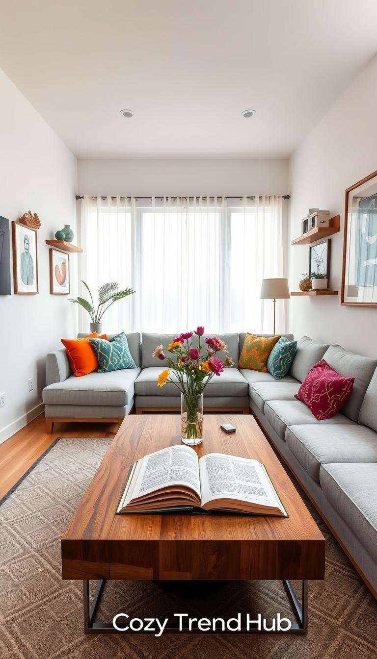
Create zones to break up a long room without building walls
Zoning turns one endless corridor into multiple functional pockets that feel intentional and cozy.

Use rugs to anchor each area. One rug per zone creates clarity. Layered rugs work when budget is tight and still prevent floating furniture and that endless-hallway effect.
Light defines each activity pocket
Pendants can mark a dining or game table area. A floor lamp will warm a seating nook. Table lamps add task light for reading and soften the sightline.
Vertical pieces stop the eye
Bookcases, tall cabinets, and armoires balance long horizontal walls. They add a visual stop at the far end and provide storage without crowding walkways.
Flexible seasonal zones
Reserve a front nook that can host a holiday tree, extra party seating, or a plant sunlight area. This keeps the layout useful year-round.
- Affiliate prompts: rug options (pile height, low-profile pads), lighting categories (pendant vs. floor footprint), bookcase depth for narrow paths.
- Renter-friendly tip: freestanding shelves, plug-in lamps, and washable rugs avoid hard upgrades.
Helpful next step: Compare rug sizes and lamp footprints before buying, and read this guide to small-space styling at aesthetic small-space ideas.
Traffic flow rules for narrow living room layouts that feel easy to walk through
A single, consistent path through the space keeps traffic from pinching seating areas.

Where to place the main walkway
Define one clear route and keep it consistent along a side wall when possible. This prevents people from splitting across the room and squeezing the central zone.
Typical placement depends on door and window locations. When doors sit on the same edge, run the walkway beside that wall to preserve open seating and avoid blocked sightlines.
Common layout mistakes that create detours
Avoid pushing sofas or chairs into the path. Bulky side tables and deep consoles can create constant detours around chair backs.
In a narrow living room, these errors turn a clean flow into a maze and reduce usable seating.
When angling furniture helps — and when it hurts
Angling a sofa can soften a rectangle and point attention to a focal wall or TV. Do it only if at least 30–36 inches of clearance remains along the main way.
If angling steals walkway width, it backfires. Prioritize straight placement when traffic is heavy.
| Need | Clearance | Shopper fix |
|---|---|---|
| Walkway | 30–36 in | Slim console, moveable bench |
| Center table | 18 in around seating | Round or oval coffee table |
| Accent seating | Allow 24–30 in pass | Armless chairs, ottomans |
Quick guidance: families benefit from defined paths; renters should favor lightweight, movable pieces; hosts want flexible seating that shifts easily.
Pick a focal point that makes a long narrow room feel intentional
A strong anchor at one end of the space helps avoid random furniture placement and creates a cohesive living room layout. A clear focal point guides where the sofa, seating, and lighting belong.

Fireplace as an anchor
Why it works: A fireplace naturally reads as a center of attention. Keep mantel styling simple—one large mirror or art, a low pair of lamps, and limited small accessories.
Placement notes: Leave clearance so heat and walkways stay unobstructed. Flank the fireplace with slim storage or tall plants rather than bulky seating.
Minimizing the TV’s visual weight
Use a low-profile media console and a darker painted wall behind the screen to reduce contrast. A gallery wall around the TV or a framed, screen-sized art piece helps it blend.
Mounting is an option, but renters should consider no-drill mounts or using a console with a stand to avoid holes.
Create a focal wall when there’s no fireplace or TV
One oversized art piece, a large mirror, or a narrow console styled with layered objects can serve as an intentional point. Keep scale in mind: art should take roughly two-thirds of the short wall width.
| Focus Type | Pros | Cons / Buyer Notes |
|---|---|---|
| Fireplace | Entertaining anchor, natural heat | Avoid crowding mantel; check clearance |
| TV with console | Functional, hides cables, low profile | Console depth must fit path; mount limits for renters |
| Art or mirror wall | Design-forward, flexible | Measure scale; hardware weight matters |
Best for: TV-minimizing solutions suit design-focused renters; fireplace-forward layouts suit people who entertain; art focal walls suit quiet lounge setups.
Buyer considerations to compare later: console depth (keep narrow aisles), mounting vs. no-mount options, and scale rules for art and mirrors. For more small-space styling pointers, see small bedroom ideas.
Best decor for long narrow rooms that instantly improves proportion
A few carefully chosen pieces shift how the eye reads a stretched living area. The goal is visual balance: add height, stop long sightlines, and increase reflected light without crowding the walkway.

Large mirrors to bounce light and widen the feel
Placement: opposite windows or near dark stretches to reflect natural light. Shapes: tall rectangles or oversized circles work best to read as a vertical element.
Statement art on short walls
Use one large piece or a tight cluster to „stop the eye“ at the far end. Choose scale that fills two-thirds of the short wall width.
Tall plants and trees
Place in corners, beside a console, or near a dead end to add height and soften edges. Tradeoffs: real plants need care; faux options save time and budget.
Renter-friendly built-in look
Pair slim bookcases with a centered bench and matching styling to mimic built-ins. Anchor tall pieces to studs and check depth so the path stays at least 30–36 inches wide.
| Piece | Best for | Pros | Cons |
|---|---|---|---|
| Mirror | Brightening dark stretches | Adds light, widens view | Wall weight, possible glare |
| Statement art | Short wall anchor | Stops sightline, low maintenance | Scale mistakes look off |
| Tall plant (real/faux) | Softening corners | Adds height, texture | Care or dusting; planter footprint |
| Paired bookcases + bench | Renter-built-in | Storage, cozy end zone | Must anchor; depth can steal path |
Rugs that fix long narrow rooms: sizing, shapes, and placement that define areas
Rugs have the power to break a long plan into clear, usable zones. A well-placed rug anchors seating and prevents furniture from „floating“ down the length.

Rectangle vs runner vs layered rugs
Large rectangle rugs suit primary seating: place front legs of the sofa on the rug to unify the group.
Runners mark walkways and protect high-traffic strips without overwhelming the floor. They help guide traffic flow along one side.
Layered rugs offer texture on a budget and let a small area rug visually define a pocket atop a larger base.
Color, pattern, and room feel
Lighter tones brighten dark stretches and make the room feel wider. Low-contrast patterns hide wear along busy paths. Avoid very busy prints that compete with other focal points.
Renter-friendly pads and low-profile picks
- Pad choice: nonstick felt or grip pads that won’t stain the floor.
- Pile height: low-profile rugs clear door swings; thick piles can block doors.
- Maintenance: choose stain-resistant fibers and flat weaves for easy vacuuming.
„Measure before you buy: confirm sofa leg placement and door arcs to avoid surprises.“
| Feature | Pro | Con |
|---|---|---|
| Pile height | Comfort, warmth | Door clearance issues |
| Pattern | Hides wear | Can add visual clutter |
| Pad type | Protects floor, keeps rug stable | Some pads discolor sensitive finishes |
Lighting for narrow living rooms: brighten dark stretches and create balance
Lighting can fix dark stretches and make a slim living area feel balanced and intentional.
Why dark stretches happen: long sightlines and one overhead fixture leave far ends in shadow. A layered approach evens light and marks separate areas without adding walls.
Layered plan: overhead + floor + table lamps
Overhead gives general brightness. Floor lamps balance along the side and break the run. Table lamps add reading light and warmth in each zone.
Floor lamps that fit tight footprints
Choose slim bases and narrow stems. Upward shades add ambient glow; downward or adjustable arms give task light without a side table. Check base diameter and cord length before buying.
Wall sconces as renter-friendly surface savers
Sconces free up side surfaces and mark zones. Plug-in or adhesive-mount units suit renters. Tradeoffs include visible cords, battery upkeep, and adhesive limits versus a clean hardwired look.

„Layered lighting prevents one bright spot and creates useful pockets of light across the space.“
| Attribute | Lumens / Brightness | Shade Size | Cord Length / Placement | Sightline Impact |
|---|---|---|---|---|
| Overhead | 1500–3000 lm (general) | Varies; choose low-profile | Hardwired; central placement | Minimal if recessed or flush |
| Floor lamp | 800–1600 lm (task + ambient) | Medium to small; narrow base | 6–10 ft cord; consider outlet locations | Low if slim base and narrow shade |
| Plug-in sconce | 400–1000 lm (accent) | Small to medium | Cord visible or routed; battery option | Low visual bulk; watch cord run |
For buyer tips, prioritize lumens for function, a small base to protect walkways, and cord routing that keeps paths clear. Renters can read a helpful cozy lighting guide at cozy lighting guide.
Wall decor that works in long rooms (without turning it into a hallway gallery)
A tall mirror or vertical print will redirect the eye up and shorten the perceived length of the room. That single move helps create a sense of balance without adding clutter.
Too many small frames placed in a row tend to stretch a wall visually. This „hallway gallery“ effect makes the space feel busier and slimmer.
One oversized piece vs a tight grid
One oversized anchor is fast and clean. A single large art or mirror fills about two-thirds of a short wall and becomes a restful stop at the end of the plan.
Tight grid works when scale is consistent and the wall is short enough to avoid repeating the corridor effect. Use a tight, balanced grid only if frames match and spacing is precise.
Vertical emphasis tricks to counter long horizontal walls
- Tall art and stacked frames draw the eye upward and add a sense of height.
- Narrow vertical mirrors reflect light and break long sightlines without wide footprint.
- Wall sconces placed above eye level create upward movement and free side surfaces.

Window adjacency and alignment
Avoid fighting window trim or curtains. Center art within the furniture zone, not the full wall, so it reads with the seating group rather than competing with the window.
When art sits beside an operable window, leave enough clearance for hardware and curtain stack so nothing feels cramped.
Renter-friendly hanging options and tradeoffs
Picture ledges let you swap pieces often and avoid wall holes. Removable hooks work for lightweight frames but have weight limits and may pull paint on sensitive finishes.
„It’s OK to leave walls empty until the right piece appears.“
| Option | Pros | Cons / Notes |
|---|---|---|
| Oversized art or mirror | Fast anchor, low visual clutter | Must match scale; heavy pieces need secure hanging |
| Tight grid of frames | Structured look, repeatable | Can lengthen the wall; needs precise spacing |
| Picture ledge | Swap-friendly, renter-safe | Limited weight; shelf depth affects frame selection |
| Removable hooks | No-drill, simple install | Weight limits; possible paint pull on removal |
Buying considerations: check frame glare under your lamps, confirm hanging hardware matches wall material, and choose pieces that support the room’s focal point rather than compete with it. For layout ideas that pair wall choices with furniture, see a guide to layouts at long living room layout ideas and tips on neutral mixes at neutral style planning.
Windows in long narrow rooms: treatments that add height and keep it functional
Framing a window correctly can lift a room visually while keeping ventilation and access intact.
Maximize daylight to reduce the tunnel effect while keeping operable windows usable for fresh air. The goal is bright, airy walls without sacrificing privacy or blocking the way furniture needs to sit.
Sheers vs heavier curtains
Sheers brighten the space and soften light. They are lightweight and stack easily so the glass stays exposed.
Heavier panels give privacy and cut glare. They also add visual weight and can make a narrow room read as slimmer if overused.
Avoid blocking operable windows
- Keep bulky furniture off the sill line and choose low-profile seating near windows.
- Leave clearance for shutters, casement swings, and window handles.
- Plan mirror and lamp placement so reflected light and glare remain useful rather than distracting.

Renter-friendly rods and no-drill shade options
Use tension rods where trim allows, no-drill brackets, or adhesive shades. Note weight limits: heavy panels usually need anchored hardware.
| Option | Use case | Pros | Notes |
|---|---|---|---|
| Sheer panels | Max daylight | Light, stacks off glass | Low privacy; pair with shades at night |
| Heavier curtains | Privacy & glare | Blocks sun, insulates | Requires anchors; can narrow sightline |
| No-drill shades | Renters | Easy install, low damage | Trim depth check; limited sizes |
| Tension rod | Light curtains or sheers | No holes, adjustable | Not for heavy panels |
„Buying checkpoints: panel length to add height, rod width to stack off glass, and shade depth to clear trim.“
Choose based on privacy and light needs, then confirm clearance so the chosen window plan supports later purchases like mirrors, lamps, and plants. For styling ideas and installation tips, see this guide on window dressing.
Small-space furniture accents that double as decor (and solve real problems)
Small, multifunction pieces often deliver the biggest impact in tight plans. These high-ROI furniture accents keep circulation clear while adding function and style.

Round coffee tables that improve flow
Why choose round: rounded edges reduce bruises and make passes feel easier. Aim for a diameter that leaves 18 inches around seating.
Tradeoffs: less flat surface for trays and heavier serving items. Lightweight tables can shift if bumped.
Ottomans that act as extra seating
Ottomans slide in and out of service. They work as stools, footrests, or an ad-hoc side table with a tray on top.
Pros: mobile, often storage-ready. Cons: they can collect clutter without a staging habit.
Console tables behind sofas to define zones
A slim console creates a clear zone line and adds lamp and storage space without depth. Keep depth under 12–14 inches to protect the main path.
Choose models with drawers or baskets for hidden storage and easy renter swaps.
Go vertical with storage pieces
Tall cabinets, armoires, and bookcases save floor width. They stop long sightlines and add real storage without broad footprints.
Safety note: anchor tall pieces to studs. Renters can use anchoring kits that leave minimal marks.
„Pick pieces that move easily and serve multiple roles—this reduces clutter and keeps walkways open.“
| Piece | Depth (in) | Weight | Mobility | Materials (durability) |
|---|---|---|---|---|
| Round coffee table | 30–36 dia / 18 clearance | 10–40 lb | Usually fixed; lightweight moveable | Wood, metal, tempered glass |
| Ottoman (storage) | 16–22 | 8–25 lb | Highly mobile; add casters if needed | Upholstery, leather, woven |
| Slim console | 10–14 | 15–60 lb | Moderate; narrow profiles easy to slide | Metal frame, veneer, solid wood |
| Tall bookcase / cabinet | 12–16 | 40–150 lb | Low; typically stationary | Plywood, MDF, solid wood |
For shopping comparisons and layout ideas that match small-scale pieces, see layout suggestions at long living room layout ideas and renter-friendly styling tips at cozy living room guidance.
Best decor placements for long narrow living room seating areas
Selecting the right seating arrangement prevents walkways from becoming cramped and keeps zones clear.

Two-sofa conversation
Place two sofas facing each other when width allows. This layout creates an intentional conversation zone and suits frequent hosts and families.
Pros: lots of seating, balanced focal point.
Cons: needs wider aisles; choose slim-armed sofas and a narrow table to preserve a 30–36 in path.
Sofa plus chairs
Use a single sofa with two lightweight chairs when space is tight. Chairs can be moved to open the path during entry or parties.
Buying notes: pick armless or swivel chairs and small side tables to reduce visual bulk.
Bench on the short wall
A bench under oversized art or a mirror stops the eye and makes the far end feel intentional. It works as extra seating and a staging spot.
Tradeoffs: limited back support; add cushions and a low table to increase comfort.
Fixing the dead-end wall
Create a destination with a narrow console, tall plant, and an oversized mirror or paired bookcases. Keep pieces shallow so the walkway stays clear.
- Keep windows operable and clear curtain stacks.
- Don’t block fireplace clearance or door swings.
- Maintain a predictable main path of 30–36 in.
„Choose movable seating and slim tables so the layout adapts to daily use.“
| Template | Works when | Key buys |
|---|---|---|
| Two sofas facing | Width ≥ 12 ft; family/hosts | Slim-arm sofas, narrow coffee table, bench option |
| Sofa + chairs | Width 9–11 ft; tight traffic | Armless chairs, small side tables, round table |
| Bench short wall | End needs anchor; non-TV focal | Bench, oversized art/mirror, tall plant |
Renter-friendly upgrades that change a room without renovation
Small, reversible upgrades let renters change how a room reads without drilling or big spend.

Why it matters: reversible fixes are high impact and low risk. They preserve deposits and still solve proportion, light, and flow problems in tight space.
Peel-and-stick and plug-in options
What to try: picture ledges, heavy-duty adhesive hooks, and plug-in sconces. These add display, hanging points, and extra light without hardwiring.
Quick note: check weight limits and adhesive type before installation to avoid failures on textured surfaces.
Styling awkward features
Normalize bump-outs and pass-throughs with symmetry: a paired frame set, a slim console, or a tall plant. These choices stop the eye and keep the main path clear.
Budget swaps with big payoff
A correctly sized rug, improved layered lighting, and one large mirror deliver the most change per dollar. Each piece redirects sightlines and widens the feel of the room.
„Focus on reversible, visible wins: rugs, mirrors, and plug-in lights.“
| Product | What to compare | Pros | Cons |
|---|---|---|---|
| Adhesive hooks/ledges | Adhesive type, weight limit | No holes, easy swap | May fail on textured paint |
| Plug-in sconce | Cord length, mounting method | Adds zone light, renter-safe | Visible cord; outlet placement |
| Large mirror | Weight, hanging hardware | Widen visual space | Needs secure hanging; heavy |
Affiliate checklist: compare weight limits, adhesive residue, cord length, and whether the item needs holes. For renter design tips and more reversible ideas, see renter design hacks.
Seasonal styling for long rooms without disrupting layout
Seasonal touches can refresh a living area without changing how people move through it. In long plans, decorations often drift into the main walkway or collapse a carefully laid-out zone. A clear, repeatable rule prevents that: keep the main path free and update only movable accents.

Winter: cozy lighting, layered textiles, and flexible seating
Add warmth without crowding: swap thin throws for thicker layers and add table lamps or battery candles to low shelves. These boost ambient light without changing furniture placement.
Keep traffic steady: use moveable ottomans and lightweight stools rather than permanent benches in the walkway. Slide them out when guests arrive and tuck them back afterward.
Spring and summer: plants, lighter colors, and airy zones
Lighten the palette: trade heavy throws and dark pillows for lighter textiles and breathable slipcovers. This reduces visual weight while keeping the same zone boundaries.
Place plants with purpose: set taller pots near short walls or corners so they add height without blocking windows or the main way. Move potted plants toward sunlight while keeping outlet and door clearance in mind.
Holiday setup: where the tree goes so flow still works
Choose the most flexible zone—often a front nook or an end zone that already functions as a staging area. Plan cord routes, outlet access, and a clear 30–36 inch path around the tree so people don’t detour into seating.
„Keep one consistent rule: if it blocks the main path, move it.“
Who benefits: renters can use temporary hooks for garlands; families should keep fragile items off busy paths; hosts gain from foldable seating and mobile ottomans.
| Season | What to swap | What to keep |
|---|---|---|
| Winter | Extra lamps, thick throws, battery candles | Rug anchors, main seating, console placement |
| Spring/Summer | Light slipcovers, brighter pillows, movable plants | Zone rugs, layered lighting plan, floor clearance |
| Holidays | Tree collar, cord covers, moveable seating | Main walkway, media console, primary rug |
Buyer-intent note: prioritize portable items (battery candles, plug-in lamps, collapsible stools) over large seasonal purchases. Keep core pieces—rug anchors and main seating—consistent so zones and flow stay reliable all year.
How to compare picks before you buy (dimensions, materials, and maintenance)
A short, repeatable comparison method prevents impulse buys that crowd walkways or block doors. Use your floor plan and a tape measure as the baseline for every purchase decision.

What to check for rugs
Pile height: pick low pile where door swings or heavy foot traffic occur to avoid catching and edge curling.
Cleaning needs: consider fiber and stain resistance for main walkways; washable or low-maintenance rugs last longer in busy homes.
Slip resistance: always pair with an appropriate pad to stop movement and protect the floor.
What to check for lighting
Brightness: choose lumens by zone—ambient overhead for general, 800–1600 lm for task near seating or a table.
Shade size and footprint: narrow bases and small diameters keep the path clear in tight plans.
Cord placement: route cords away from the main way and measure outlet distance before buying to avoid trip hazards.
What to check for mirrors and wall art
Scale: art should read with furniture groups; aim for pieces that fill about two-thirds of the short wall width when anchoring a point.
Weight and hanging: confirm hanging hardware, use anchors or stud mounts, and choose removable hooks for rental walls when possible.
Comparison checklist: Dimensions → Footprint/clearance → Materials → Maintenance → Hanging/mounting needs.
Quick pros and cons framework for affiliate tables
Use this template when building comparisons: Solves (problem), Best for (user/space), Watch-outs (constraints), Maintenance, Footprint/clearance.
Before buying, match each spec to your measurements and pain points rather than trends. For renter-focused styling and small-space guidance, see an apartment styling guide.
| Item | Key check | Quick pro | Quick con |
|---|---|---|---|
| Rug | Pile, pad, cleaning | Defines zone | Can catch door swing |
| Light | Lumens, shade size, cord | Fixes dark stretches | Cord/trip risk |
| Mirror/art | Scale, weight, mount | Stops sightline | Heavy mounts on rental walls |
Conclusion
End by focusing on a few measurable steps that make the layout feel intentional.
Measure the room, map traffic flow, define the living room’s purpose, create zones, pick a focal point, then buy pieces that support the plan. This sequence turns ideas into practical choices and avoids oversized purchases.
Main takeaway: pick items that solve a specific constraint—dark stretches, pinched walkways, an undefined seating area, or a dead-end wall—rather than chasing trends.
High-impact wins include properly sized rugs, layered lighting, a large mirror, vertical storage, and a short-wall focal moment. Renters benefit from plug-in sconces, removable hangers, ottomans, and round coffee tables that protect flow.
Quick checklist: confirm door swing clearance, keep windows operable, protect the main way, and avoid furniture that is too deep. Sketch today, then compare options by dimensions → maintenance → installation → style.
For more practical ideas, see this small-space styling guide.