Modern neutral means calm colors, strong texture, and a few high-contrast details that stop a space from feeling flat.
This guide frames common renter and small-space problems and gives clear solutions. It addresses blank walls, low light, echoey rooms, mismatched finishes, and „everything is beige“ fatigue.
The article promises practical pros and cons, renter-friendly installation tips, and buying considerations that help readers shop with confidence. It highlights pieces that move between rooms and clean easily.
Readers can jump to quick picks by use case: walls, rugs, curtains, textiles, wood, metals, black accents, and art. The recommendations are framed as „best for,“ „why it works,“ „what to measure,“ and „pros/cons.“
Note: Neutral does not mean no design. Intentional mixes of tone, material, and shape create a warm, modern look that works in a compact apartment.
Key Takeaways
- Modern neutral balances calm palettes with texture and contrast.
- Solutions target renter limits: easy install, low-damage, and portable pieces.
- Guide includes shopping notes: measurements, pros/cons, and care tips.
- Quick-pick categories let readers jump to the exact solution needed.
- Warm undertones add coziness; black can act as a neutral accent.
What “Neutral” Really Means in Apartment Decor (and Why It Can Look Flat)
A room of quiet colors still needs hierarchy—otherwise everything blends together.
Define the palette: Neutral colors typically include white, cream, beige, tan, gray, greige, and taupe. These shades act as a backdrop. Their undertones (warm vs. cool) change how a space reads under different light.

Why neutrals can feel flat
The main issue is matching value levels. If walls, furniture, and textiles share the same tone, the eye has nothing to prioritize.
Add texture, scale, and at least three related tones to create depth. Small rooms benefit from varied materials that suggest layers rather than sameness.
Why beige gets a plain reputation
Beige becomes „boring“ when every finish and fabric repeats the same shade. There is no visual hierarchy.
Fix it by mixing at least three related tones and adding tactile pieces—rugs, woven pillows, or a sculptural lamp—to break uniformity.
How black works as a grounding neutral
Black adds structure and contrast without introducing bright color. In small spaces it defines edges and prevents furniture from „floating.“
- Matte black frame — anchors art and creates a focal point.
- Black lamp base — grounds side tables and improves perceived scale.
- Small black vase — adds depth on shelves without overpowering the palette.
Choose tones based on lighting, layer materials for depth, then add controlled contrast to sharpen the scheme.
| Problem | Quick renter-friendly fix | What it solves | Why it works |
|---|---|---|---|
| Flat walls | Textured throw or rug | Restores depth | Adds tactile contrast without paint |
| Floating furniture | Matte black lamp base | Anchors pieces | Creates visual weight and edge definition |
| All-same shade | Layer three related tones | Creates hierarchy | Varied values guide the eye |
| Low light | Warm undertone textiles | Prevents cold look | Reflects warm light and feels cozy |
How to Choose a Neutral Palette That Looks Modern in Small Spaces
Start by choosing a warm backbone that makes small living areas feel intentional and calm.
Use warm undertone neutrals—creams, beige, tans, browns, and greiges—to create a cozy backdrop. These tones read friendlier in rental units with basic lighting. Cooler grays can feel sterile in compact rooms.

Step-by-step selection strategy
- Pick a base neutral for walls or large furniture (light cream or soft greige).
- Add a secondary neutral for textiles—choose a mid-tone beige or taupe.
- Choose a grounding accent (black, warm wood, or brass) to anchor the room.
Buyer-focused checklist
- Sample swatches: view in morning and evening light.
- Compare swatches next to flooring and existing upholstery.
- Measure large pieces and plan rug size before buying furnishings.
- Avoid exact matches; mix at least one light, one mid, and one deep tone.
| Constraint | Action | Why it matters |
|---|---|---|
| Low light | Keep walls light; add warm textiles | Bounces light and adds cozy depth |
| Rental limits | Use rugs, curtains, and freestanding shelves | Add depth without repainting or repairs |
| Small footprint | Choose slim silhouettes and layered tones | Improves flow and reduces visual clutter |
Tip:Think function first:a clear palette improves flow and makes small living spaces feel calm and purposeful.
Best Neutral Decor for Apartments: Quick Picks by Problem You’re Solving
Small changes can solve big visual problems in a rented living space—this quick guide shows which ones to pick.

Blank rental walls
- If this: blank walls → buy: peel-and-stick scenic wallpaper or an oversized mural-style print.
- Best for: renters who can’t paint and studios that need a focal wall.
- Buyer notes: check adhesive type and test a small patch; scale art to two-thirds the sofa width.
- Tradeoff: peel-and-stick may fail on textured plaster.
Cold, echoey room
- If this: hollow sound → buy: low-to-medium pile rug + lined curtains and extra textiles.
- Best for: living room zones and open studios that need softening.
- Buyer notes: rug rule: at least front legs on; curtain length: floor-skimming with lining for warmth.
All-beige, no personality
- If this: bland palette → buy: patterned pillow sets, sculptural lighting, and small black accents.
- Why: pattern and texture create hierarchy while black provides a modern focal point.
Low-light rooms
- If this: dim room → buy: layered off-whites and warm textiles to add warmth without glare.
- Buyer notes: choose warm off-whites and avoid heavy blackout layers unless staged over a lighter panel.
„Keep the base calm; add interest with texture, scale, and a single contrasting accent.“
| Problem | Quick pick | Who it’s for |
|---|---|---|
| Blank walls | Peel-and-stick or oversized art | Renters, studios |
| Echoey room | Rug + curtains | Open plans, living room |
| Bland beige | Pattern + black accents | Shared spaces, roommates |
| Low light | Warm off-whites layered | North-facing units |
Renter-Friendly Wall Updates That Don’t Risk Your Deposit
Small, reversible changes turn a blank wall into a calm, intentional backdrop. The priority is simple: add texture and scale without permanent work. Below are practical, deposit-safe options and who they suit.

Peel-and-stick wallpaper vs. removable murals
Peel-and-stick works well on long walls, behind sofas, and in entryways. It is best when a repeating pattern can anchor a room and cover large stretches evenly.
Removable murals are ideal when one focal wall is needed. They avoid seams and read like a single graphic plane.
How to compare renter-safe options
- Adhesive strength: look for repositionable glue that lifts cleanly.
- Finish: matte hides scuffs; glossy shows reflections.
- Surface: lightly textured paint may reduce stick—test a sample.
Oversized art and temporary ledges
Large frames deliver immediate design impact with minimal holes. They are the fastest path to a curated backdrop without committing to wall coverings.
Art ledges let renters rotate prints and objects with a single, low-hole installation. A 3–4-hook setup can look editorial while keeping damage minimal.
Damage-minimizing hanging tips
- Use removable hooks rated for the weight (check package ratings).
- Distribute heavy pieces across two points or secure to studs when possible.
- For very heavy frames, use small anchors or picture-hanging kits meant for drywall.
„Choose calm patterns in tonal shades to add movement without shrinking a small room.“
| Option | Best use | Removal notes |
|---|---|---|
| Peel-and-stick wallpaper | Long wall, behind sofa | Peels off; may need mild cleaner |
| Removable mural | Single focal wall | Lift edge slowly; store flat |
| Oversized frame | Quick impact | Small nails or anchors; easy to replace |
Quick guidance: pick calm, tonal materials and keep holes low. That approach adds architectural interest while protecting a tenant’s security deposit.
Neutral Paint Color Strategy for Apartments (When Painting Is Allowed)
Choosing the right wall shade prevents costly mistakes and keeps a small room feeling intentional.
Who should paint: long-term renters with written permission, tenants who received landlord approval, or anyone trying to neutralize mismatched wall colors before selling or subletting. Those without approval should skip paint and use textiles, art, or removable panels instead.

Warm-neutral direction
Creams and warm beiges work best in low-light rooms to add subtle warmth. Greiges balance cool and warm furnishings. Use tans or soft browns sparingly as grounding accents on one wall or trim.
How to test undertones
- Paint large sample boards and place them by your baseboard and upholstery.
- View at morning, midday, and evening light to note shifts.
- Compare samples under warm and cool bulbs; undertones change with light source.
Finish: matte vs. eggshell
Matte gives a modern, low-reflective look and hides minor wall flaws. It scuffs more easily and is harder to clean.
Eggshell cleans better and resists marks, but can show roller marks or patchwork in some lighting.
| Decision | When to choose | Why it matters |
|---|---|---|
| Matte | Living room with imperfect walls | Modern look; hides texture but needs gentle care |
| Eggshell | High-traffic rooms or families | Durable finish; easier touch-ups and cleaning |
| Sample & test | Always before full coat | Avoids wasted paint and repaint costs |
Buying tips: calculate gallons based on wall area plus 10–15% for touch-ups. Match sheen for future repairs and document written approval if repainting is required at move-out. Let wall color support furnishings by choosing a backbone tone that complements textiles and wood accents.
Area Rugs That Anchor a Neutral Living Room Without Shrinking the Space
In small living spaces, the right rug unifies furniture and reduces echo without shrinking the room.

Why a rug helps: it anchors floating seating, cushions sound, and adds depth through texture or low-contrast pattern. Rounded rugs or repeated circular motifs can improve flow around coffee tables and chairs.
Size, pile, and placement
- Rule: front legs on the rug for seating to avoid a „postage stamp“ feel.
- Choose low-to-medium pile so doors clear and vacuuming stays simple.
- Use a rug pad to keep edges flat and protect floors.
Materials and maintenance
Prefer washable blends or stain-resistant synthetics in high-traffic rooms. Nubby weaves and mixed piles hide wear and shed less visibly than flat solids.
Solid vs. patterned — quick tradeoffs
| Type | When to choose | Key benefit |
|---|---|---|
| Solid tonal rug | Already-busy furniture or art | Calm backdrop; reads larger |
| Tonal pattern rug | Plain furnishings or blank walls | Camouflages stains; adds subtle interest |
| Textured weave | High traffic living room | Adds depth without strong color |
„Pick scale and pile before color—size and texture define how the room breathes.“
Curtains and Window Treatments That Warm Up Neutrals (and Look Expensive)
Curtains do heavy lifting: they control light, add insulation, and set a calm tone.
Layer cream, ivory, and taupe panels to create a soft, modern backdrop. Use off-white sheers closest to the glass and heavier taupe or textured panels outside. Mixing textures—linen blends, nubby weaves, and smooth cotton—adds depth without adding color.

Why this solves apartment pain points
- Privacy: layered panels block sightlines in close buildings.
- Light control: sheers filter daylight; heavier panels cut street glare.
- Insulation: lined curtains reduce drafts and add warmth.
Measurement and renter-friendly install
Mount rods near the ceiling and extend them 6–12 inches past the frame. That makes windows read larger and lets more light in when panels are open.
Keep panels long—floor-skimming or a 1-inch puddle reads tailored. Use tension rods, adhesive hooks, or no-drill brackets when drilling isn’t allowed.
Light-filtering vs. blackout — quick tradeoffs
| Type | Living room | Bedroom |
|---|---|---|
| Light-filtering | Keeps living spaces airy; preserves daylight in north-facing rooms | Good for naps; reduces glare but not full darkness |
| Blackout | Blocks glare but can make small living rooms feel dim in daytime | Ideal for shift workers and deep sleepers; maximizes privacy |
| Layered approach | Sheer + lined panel balances brightness and privacy | Sheer daytime, blackout at night offers flexible control |
Who each treatment suits and fabric notes
Street-facing units benefit from heavier outer panels. Small living rooms that need light should favor light-filtering sheers plus thin-lined panels. Bedrooms requiring total darkness should add blackout lining.
Fabric tips: choose washable blends if in-unit laundry is limited. Linen blends add texture; smooth weaves look tailored. Pick undertones—warm cream or cool taupe—to match flooring and wall color for a cohesive backdrop.
„Layered fabrics add softness and depth while solving real apartment problems—privacy, light, and warmth.“
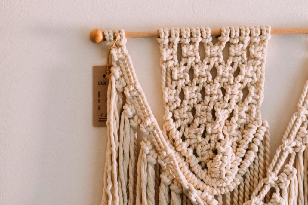
Textiles That Make Neutral Rooms Feel Intentional, Not Bland
Textiles are the fastest way to give a calm room clear personality without swapping big pieces. Small swaps change mood, add texture, and solve flatness or seasonal comfort issues.

Throw pillows: mixed weaves and subtle patterns
Pillows anchor a sofa or bed and update a look instantly. Aim for varied weaves, tone-on-tone patterns, and a subtle stripe to keep things calm but interesting.
- Who should buy: renters and seasonal refreshers who want quick impact.
- What it solves: flatness, lack of scale, and missing focal points.
- Mix rule: 3–5 pillows—vary size and texture, repeat one color across the room.
Throws and blankets: seasonal texture
Choose chunky knits in winter for warmth. Pick linen blends in summer for breathable layering. Tightly woven throws work in high-traffic zones.
Buying considerations
| Factor | Why it matters | Tip |
|---|---|---|
| Pilling | Shortens lifespan | Test by rubbing swatch |
| Washability | Practical care | Removable covers if possible |
| Pet hair | Attracts lint | Prefer tightly woven materials |
How to add a subtle pop of soft color
Introduce muted olive or warm clay on one pillow or a throw. It still reads neutral while letting the palette sing.
- Styling rules: limit bold textile statements to one or two pieces.
- Repeat the accent tone elsewhere—a plant pot or small tray—to tie the room together.
„Tons of textures and mixed materials keep a calm palette layered and alive.“
Wood Accents That Add Warmth to Modern Neutral Apartments
Wood pieces bring an instant layer of life to calm palettes without changing paint or textiles. They add natural variation that breaks up flat walls and softens hard rental finishes.

Why varied tones create depth
Mixing two wood depths—light + medium or medium + dark—builds visual hierarchy. Matchy-matchy setups make a space feel monotone. A deliberate mix gives the eye places to rest.
Renter-friendly wood items that move easily
- Small trays and serving boards — stage and swap seasonally.
- Stools and side tables — portable anchors near seating.
- Open shelving units — freestanding storage that adds grain and texture.
- Warm-toned coffee table detail — a tray or turned-leg table that ties finishes together.
Pros and cons of common tones
| Tone | Pros | Cons |
|---|---|---|
| Light oak | Brightens low-light rooms; reads airy | Can look washed if paired with too many pale textiles |
| Medium wood | Balanced warmth; versatile with many materials | Needs a secondary tone to avoid flatness |
| Dark wood | Feels elevated and rich | Can overpower small spaces unless walls and textiles stay bright (designers like Augusta Hoffman note this) |
Buying considerations
Finish durability matters: choose water-ring resistant tops for table use. Coordinate wood with existing floors and pick materials that can be moved or returned without damage.
„Combine at least two wood depths to add warmth and stop a calm palette from feeling flat.“
Metal Finishes That Make Neutrals Look Modern and Elevated
Small metal touches can turn a flat scheme into a layered, lived-in space without repainting. Warm metals add subtle sparkle and texture so a calm palette reads intentional rather than washed out.

Warm metals and where to use them
Brass, copper, and bronze bring instant warmth and pair well with soft fabrics and wood. Use them in lighting, switch plates, frames, and small tabletop accents. These pieces move easily between rooms and suit renters who want impact with little effort.
Buying considerations
- Finish type: lacquered resists tarnish; unlacquered develops patina.
- Durability: check plating thickness and join quality on lamps and hardware.
- Practical notes: polished metals show fingerprints; brushed finishes hide them.
| Finish | Where to use | Pros / Cons |
|---|---|---|
| Brass | Lighting, knobs | Warm, bright / can show scratches |
| Copper | Small trays, bowls | Rich patina / can oxidize |
| Bronze | Frames, lamp bases | Deep warmth / heavier look |
Mixing rule: choose one dominant finish and one supporting finish, then repeat each at least twice across the room. This avoids a random, cluttered look and keeps the scheme cohesive.
„Warm metals add rich contrast without changing the base palette.“
Practical tip: warm metals suit anyone aiming for modern, cozy interior design and who wants durable, movable materials that lift a home with minimal change.
Black Accents That Ground a Neutral Color Palette (Without Making It Harsh)
A single dark accent can act like a punctuation mark, turning an all-tone room into a curated space.

Small, high-impact pieces to buy
What to add: lamp bases, frames, vases, and a few coffee table details that anchor seating. These items move easily when renting and create crisp edges without repainting.
- Lamp base: matte or brushed finish to ground a sofa.
- Frames: thin black edges make art read sharper.
- Table and tray accents: a small vase or stack of coasters ties the look together.
Matte black in bright vs. low-light rooms
In sunny rooms matte black reads sharp and modern. In low-light spaces it can feel heavy.
Use fewer dark pieces in dim rooms and pair them with warm woods and textured textiles to soften the effect.
| Problem | Suggested item | Why it works |
|---|---|---|
| Flat cream palette | Black frame or lamp | Creates focal contrast and definition |
| Floating seating | Dark lamp or tray on coffee table | Anchors the seating area visually |
| Too many tones but no edge | Repeat two black points | Gives cohesion without color change |
Pairing tip: soften black with warm tones, wood accents, and textured throws so the color reads friendly rather than stark.
„A few repeated dark points give intentionality; too many will close in a small space.“
Quick lens: ideal for renters who want modern contrast without adding bold color—use sparingly and repeat in two to three spots.
Modern Shapes and Silhouettes That Keep Neutral Furniture From Feeling Basic
When color stays quiet, form becomes the voice that defines a room.
Why silhouette matters: In a calm palette, interesting shapes add visual interest without adding color. Curves, cutouts, and sculptural profiles read as intentional design and stop furniture from feeling generic.

Sculptural seating and rounded forms
Sculptural chairs and rounded sofas soften edges and offer a modern look. They make walking paths feel natural and reduce sharp corners—useful in tight living spaces.
Small-space wins: nesting tables and curved coffee tables
Nesting tables are flexible: pull out extra surfaces for guests, then tuck away to cut clutter. They add function without permanent footprint.
| Piece | When to choose | Tradeoff |
|---|---|---|
| Curved coffee table | Studio or sofa + chairs | Improves flow; less tabletop area |
| Rectangular table | Sectional or long sofa | More surface; can block sightlines |
| Nesting tables | Flexible hosting | Smaller individual tops; highly portable |
Buying notes: match scale to seating, pick a table that fits circulation paths, and choose pieces that can move to another home without feeling oversized. Repeat a circular silhouette—rug, lamp, and coffee table—to create cohesion (Ishka Designs often uses this trick).
„Form directs the eye when color stays restrained.“
Wall Art for Neutral Apartments: Pattern, Texture, and Scale That Works
Wall art can act like architecture — it defines scale, sets mood, and reduces visual clutter in tight rooms.

Why oversized pieces suit minimalist renters: one large work needs fewer nails, reads cleaner, and often replaces a cluttered gallery wall. It gives instant impact without crowding a small room.
Scale and placement rules
- Over a sofa or bed: art should be about 60–70% of the furniture width.
- When to choose one piece: pick a single large canvas when circulation is tight or walls are limited.
Patterned and textural art ideas
Favor textural abstracts, tonal line work, and soft geometrics. These add movement while keeping a calm palette and consistent texture.
Frame, glare, and mounting notes
| Format | Finish | Glare control |
|---|---|---|
| Canvas | Unframed or wood floater | Low glare; lightweight |
| Print + glass | Brass or black frame | Use museum glass or place off direct sun |
| Acrylic | Metal edge | Bright look; pick anti-reflective option |
Hanging tips: use two anchors for heavier pieces, picture rails, or rated removable hooks to protect walls. Match one frame finish (wood, brass, or black) to other accents so the design reads intentional.
„One measured focal piece often clarifies a room more than many small prints.“
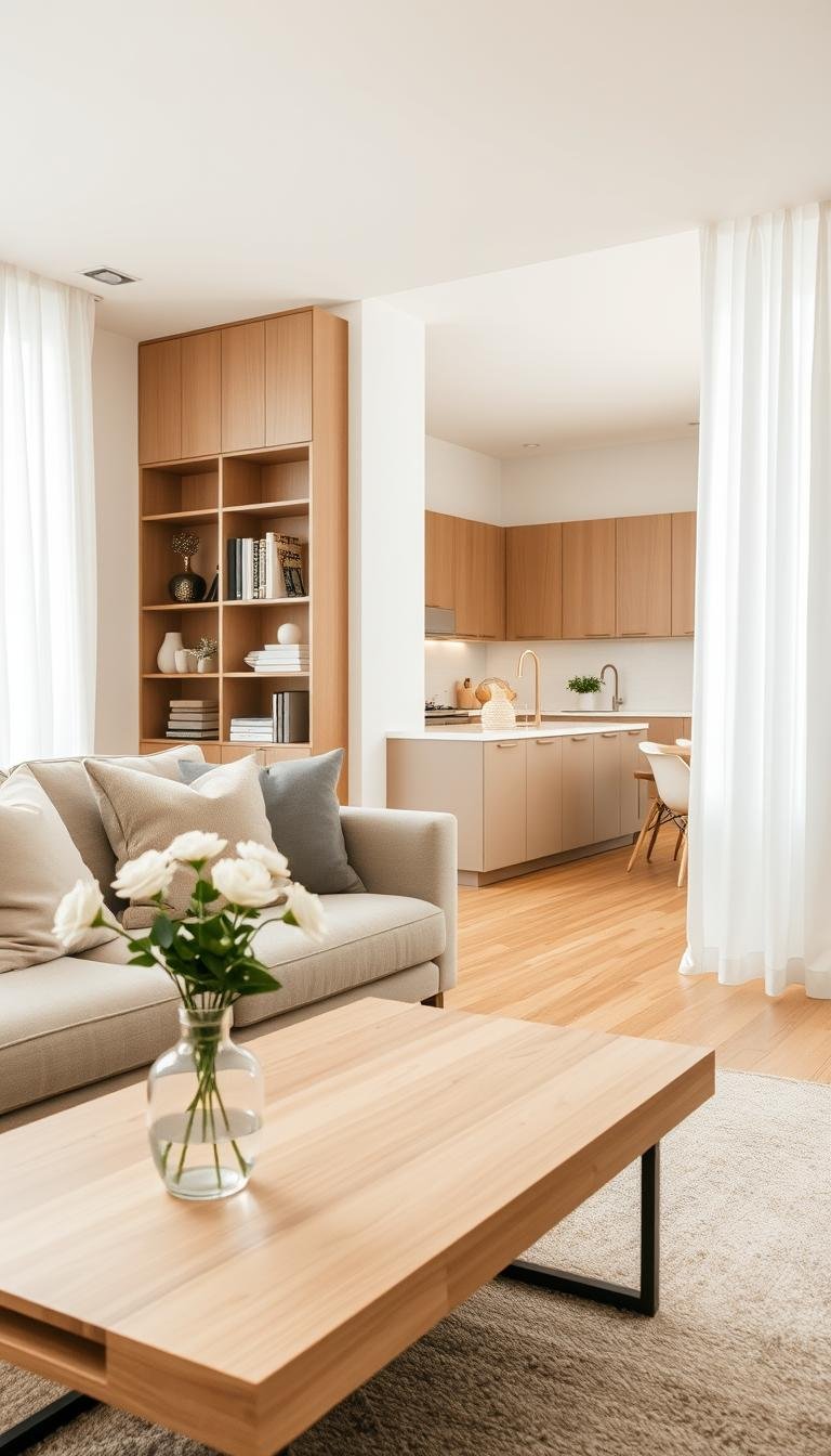
Room-by-Room: Neutral Decor Setups for Apartments
Small spaces need clear roles — this section maps out practical setups for living, sleeping, and studio zones.

Living area formula
Copy this: cream-and-taupe base, layered textures, wood accents, and a single warm metal highlight.
Start with a light sofa and a mid-tone rug to define the seating. Add a wooden side table and a metal lamp to anchor scale.
Who it’s for: renters who want a calm living room that feels edited but easy to change.
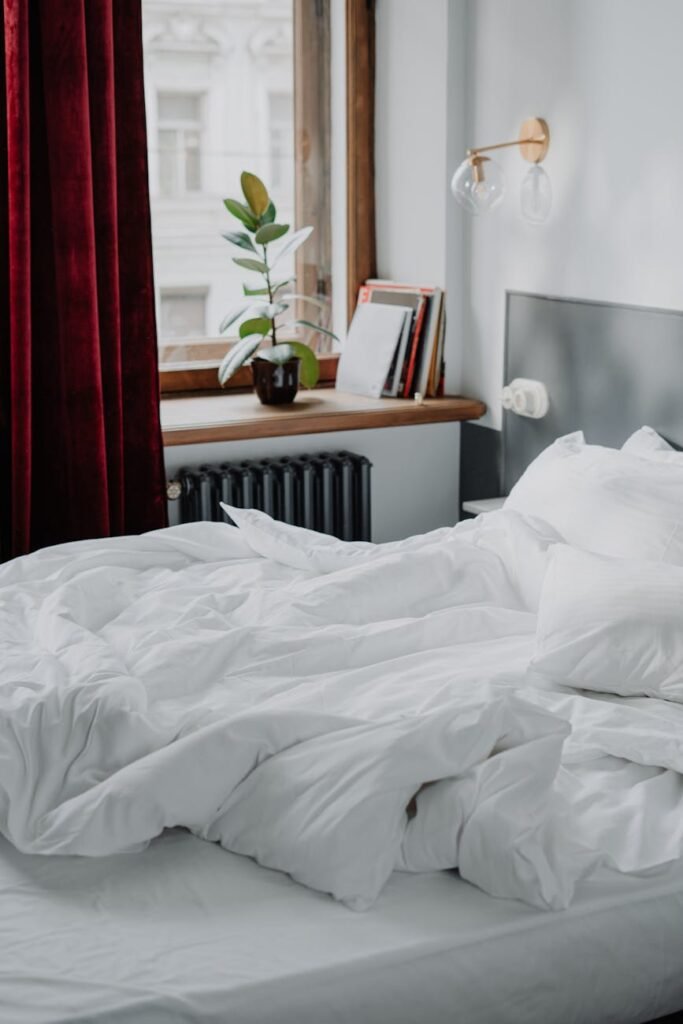
Bedroom setup
Layer off-white bedding, a low-pile rug, and soft throws. Add blackout curtains when sleep quality matters.
Tradeoff: blackout panels reduce daylight. If the room lacks sun, pick warmer tones in textiles to keep it cozy.
Studio zoning
Use a rug to create a seating zone and a different rug or runner near the bed to mark the sleep area.
Place task lighting over work surfaces and softer lamps near rest spots. Tonal contrast — light taupe vs. deep taupe — gives clear visual boundaries without color shifts.
Keeping cohesion across rooms
Repeat undertones and materials: choose warm or cool undertones and stick with two wood finishes plus one metal finish across spaces.
Upgrade sequence: rug + curtains → art → lighting. This phases spending and shows immediate impact.
| Room | Priority items | Buying note |
|---|---|---|
| Living room | Rug, sofa, wood side table, lamp | Durable rug, washable slipcovers |
| Bedroom | Bedding layers, blackout curtains, low-pill throw | Washable textiles; choose breathable fabrics |
| Studio | Rugs, multiuse lighting, shelving | Portable pieces; anchors that don’t need drilling |
„Repeat a palette’s undertone and vary shade depth to keep rooms cohesive without feeling uniform.“
Seasonal Neutral Decor Swaps That Make Your Space Feel New (Without Rebuying Everything)
A few targeted changes can shift a room’s mood between cozy and airy without replacing furniture.

Fall and winter swaps
Layer heavier textures—chunky throws, nubby pillow covers, and a denser rug. Add small brass or bronze accents to bring warmth.
Pick slightly richer taupe pillow covers or a throw to deepen the palette. These swaps add depth without changing major pieces.
Spring and summer swaps
Swap in linen-blend throws and lighter wood trays or small tables. Use brighter off-whites in linens to keep the room feeling open and breezy.
- Easy swap list: pillow covers, one throw, a small table tray, and a single seasonal print.
- Storage-friendly: fold textiles into vacuum bags or under-bed bins.
| Swap | Pro | Con |
|---|---|---|
| Pillow covers | Cheap, quick | May need washing |
| Metal accent | Adds contrast | Shows fingerprints |
| Light wood tray | Airy look | Can scratch if not cared for |
Keep a steady base palette so seasonal changes read cohesive. That way the home feels refreshed, not random.
„Layer textures, repeat a few tones, and rotate lightweight pieces for real impact.“
Conclusion
Small, targeted fixes often deliver the biggest change in how rooms feel and function. Layer multiple tones, mix texture, and add a grounding point to the palette. Warm undertones and neutral colors keep a living room cozy while wood and warm metal add depth.
Start with walls and light control, then anchor the seating with a rug. Add textiles and one dark accent to finish the room. This sequence works across rooms and keeps living edits simple.
Prioritize renter-friendly moves: peel-and-stick, oversized art, and movable pieces. Measure first, test undertones, confirm cleanability, and buy items that solve one problem.
Repeat undertones and materials—wood, metal, and one dark point—rather than matching a single shade. Pick one pain point (blank walls, echo, low light, bland beige) and make one targeted upgrade this week to see a fast, measurable look improvement in your apartment.