Many calm palettes still feel flat. A room can look soothing yet too matchy or impractical for renters and small-space living. Designers now treat neutral beyond beige, adding olive tones, stainless finishes, and mixed metals to keep spaces alive.
This guide frames the problem and a clear solution. The approach favors layering texture, varied tones, and a single anchor contrast over buying everything in the same hue. It shows how a best neutral decor mix comes together with practical choices.
The list previews 10 essentials and how each will be judged: best-for use case, what to look for, pros and cons, and quick buying notes for easy comparison. Expect renter-friendly and small-space options, plus seasonal swaps.
Readers get staged commitment levels: quick swaps like pillows, medium steps like rugs or wallpaper, and higher-impact upgrades like finishes. A lighting and undertones checkpoint helps avoid color surprises.
Start small: pick two or three items to solve one pain point—cold floors, echo, or blank walls—then build out from there.
Key Takeaways
- Layer texture and tone to avoid a flat look.
- Choose 2–3 essentials to solve one room problem first.
- Select items that suit renters and small spaces.
- Consider budget levels from swaps to upgrades.
- Check lighting and undertones before you buy.
How to Build a Neutral Decor Look That Doesn’t Feel Flat
A calm palette becomes engaging when three clear rules guide purchases: texture, layered tones, and one darker anchor. Follow these buyer-ready rules to fix flatness, cold floors, or mismatched pieces before you shop.

Use texture as pattern
Texture replaces busy prints. Choose nubby weaves, basketweave, bouclé surfaces, and mixed rug piles. These create interest without adding extra colors.
„Treat texture like your room’s pattern. It reads as intent, not clutter.“
Create depth with tints, shades, and tones
Plain terms: a tint is a lighter version, a shade is darker, and a tone has added gray. Layering them stops the single-beige block effect.
Example: ivory sofa + oat pillows + warm gray throw = visible depth that still feels calm.
Add contrast with one darker anchor
Pick one focal dark element — black, charcoal, or deep wood. Use it once as a lamp, mirror frame, or curtain rod to give the eye a place to rest.
Balance caution: more than one strong dark anchor can make a room feel smaller; add a small echo only if needed.
Quick depth formula for small rooms: one light base, one mid neutral, one deeper neutral. Repeat the trio across the room 2–3 times to build visual depth.
| Priority | What to check | Why it matters |
|---|---|---|
| Weave | Nubby vs smooth surface | Creates visual interest without new colors |
| Pile | Low, medium, or high rug pile | Affects warmth, noise absorption, and scale |
| Finish | Matte vs polished metal or wood | Controls shine and perceived formality |
| Material | Natural fibers vs synthetics | Durability and tactile quality for everyday use |
When shopping, prioritize changes in weave, pile, finish, and material over busy prints. For more ideas on bedroom treatments that follow these rules, see neutral bedroom ideas.
What Counts as “Neutral” in Home Decor (It’s More Than Beige)
Not every muted tone behaves the same in a room; knowing the difference avoids costly mistakes.
Neutral color here means muted, mixable options that either recede or support accents. That doesn’t mean no pattern or no shine. Fabrics, finishes, and veining can read as neutral while still adding texture or reflection.

Classic neutrals and where they work
Off-white and cream brighten small rooms and act as a backdrop for color swaps.
Taupe adds warmth and hides light wear; choose it for sofas and rugs.
Beige is versatile for wide surfaces, while gray serves cooler schemes and modern finishes.
Expanded neutrals for modern homes
Olive green functions like a soft neutral in upholstery or throws—it reads as calm and natural.
Stainless steel is an everyday neutral in kitchens; mixed metals (bronze, brass, gilt wood) warm cream and beige schemes.
Natural materials as reliable anchors
Wood grain, marble veining, travertine texture, limestone softness, and leather patina add depth without loud color.
Practical rule: treat largest surfaces (rug, sofa, wall) as classic choices and use expanded tones in smaller, reversible pieces like pillows or hardware.
„Use classic fields for commitment pieces and try olive or metals on items you can swap.“
For product-led ideas that follow these definitions, see this guide on neutral options for apartments. These suggestions help buyers choose fabrics, finishes, and materials with confidence in real-world design.
Buying Criteria for the Best Neutral Decor Mix in Real Homes
A clear decision framework helps buyers choose pieces that work in real apartments and small rooms. The list below prioritizes renters and compact layouts and gives easy tests before commitment.

Renter-friendly rules
Removable and repairable: choose peel-and-stick, slipcovers, and items that leave minimal wall damage.
Storeable: foldable or stackable options move with you.
Small-space priorities
Scale matters: pick fewer high-impact pieces. Prioritize multipurpose furniture and washable textiles to keep the room airy.
Undertones checklist
Quick test: place a swatch next to true white paper in daytime and at night. Note how undertones shift under different light.
North-facing rooms read cooler; warm bulbs can yellow creams.
How to avoid a too-matchy look
Mix finishes and materials: pair matte with polished, linen with leather, and repeat a finish twice only to create a curated feel.
| Criteria | What to check | Why it matters |
|---|---|---|
| Removability | Peel-and-stick, slipcovers | Protects deposits and eases moves |
| Scale & function | Dimensions, multipurpose use | Prevents clutter and keeps space airy |
| Undertones | Day/night swatch test | Avoids color surprises under different light |
| Finishes | Mix matte + polished metals | Creates a curated, lived-in style |
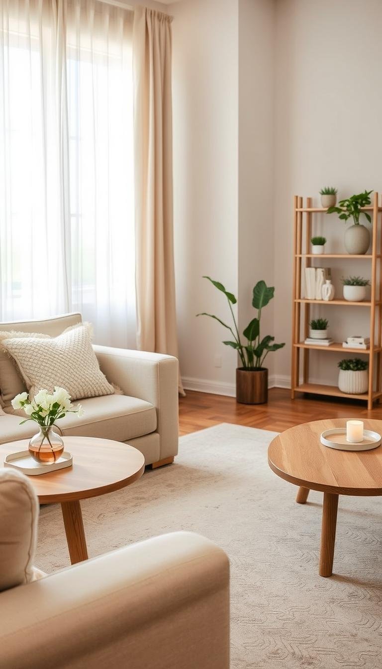
Neutral Essential: Washable Textured Area Rug for Instant Warmth
Hard floors and empty seating areas make a room feel unfinished; a textured rug solves that fast. This choice is aimed at renters and small-space owners who cannot replace flooring but want softness and definition.

Who it’s for and what it fixes
Who: renters, apartment dwellers, and anyone with echo or cold floors.
Why it helps: a washable textured area rug adds warmth, reduces noise, defines a seating zone, and brings subtle pattern without new color.
What to look for
- Pile height: low for doorways and very high traffic; medium for cushioned softness.
- Fiber and wash care: machine-washable or spot-cleanable fibers for easy upkeep.
- Backing: built-in non-slip for flat floors; use a separate rug pad for older or delicate surfaces.
- Scale: pick a rug that reaches under front legs of furniture; a slightly larger rug visually unifies the space.
| Feature | Best use | Notes |
|---|---|---|
| Pile height | Low / Medium | Low works at doors; medium gives comfort without trip hazard |
| Washability | Machine or spot clean | Machine-wash rugs may be thinner but easy to maintain |
| Backing | Built-in vs pad | Built-in OK for smooth floors; rug pad prevents slipping on older floors |
| Pattern | Subtle/tonal | Hides crumbs and pet hair better than flat weaves |
Pros and cons
Pros: warmth underfoot, sound absorption, renter-friendly impact, easy seasonal swap if tone stays neutral.
Cons: some washable rugs feel thin, corners may curl, online images can misrepresent pattern, and frequent washing can fade light tones.
„Varying pile and subtle pattern are an easy way to banish the ‚blah‘ without adding color.“
Example: choose a rug that anchors the seating area and leaves a 6–10 inch border of visible floor to keep the room feeling larger.
Use this piece as part of a thoughtful, best neutral decor mix when aiming for layered texture in a small room.
Neutral Essential: Linen or Cotton Slipcover Throw for Seasonal Swaps
A seasonal throw swaps the room’s mood faster than paint or new furniture.

Problem: a calm base can feel stale as temperatures and tastes change. Renters often can’t repaint or replace large pieces to refresh a space.
Why a slipcover throw works
Use a linen or cotton throw to shift weight and tone. It lightens a sofa for spring and adds warmth for fall. The Ojai-style linen look feels youthful and lived-in without commitment.
Fabric comparison and care
- Linen: airy, relaxed texture; pre-washed options soften and shrink less.
- Cotton: soft, easier care; good for frequent washing.
- Linen-blend: fewer wrinkles and more forgiving daily wear.
| Feature | Linen | Cotton | Linen-blend |
|---|---|---|---|
| Feel | Breathy, crisp | Soft, cozy | Balanced, smooth |
| Care | Pre-washed best; gentle wash | Machine-washable; quick dry | Machine-wash; less shrinkage |
| Best use in small space | Lightcover & arm protection | Everyday throw, pet-proof | All-season, low fuss |
Texture rule: if upholstery is smooth, choose a nubby or basketweave throw. If the sofa is textured, pick a smoother weave to avoid visual noise.
„One well-chosen throw can protect surfaces, change layers, and renew a room with zero permanent changes.“
Neutral Essential: Nubby Pillow Set to Add Depth Without Adding Color
A set of nubby pillows can rescue a flat sofa without changing the room’s color scheme.

An all-neutral sofa or bed often looks flat on camera and in person. Changing hue feels risky for renters or minimalists.
This solution adds depth through tactile contrast. Nubby weaves, bouclé-like loops, and tone-on-tone patterns read as subtle texture from across the room.
Buying considerations
- Insert fill: down for plush loft; down-alternative for allergy-friendly support.
- Insert vs cover size: choose inserts 2–4 inches larger than covers for a fuller silhouette.
- Removable covers: washable zips keep cushions fresh in small apartments.
- Pattern: mini checks, ribbing, or subtle loops that read as tone-on-tone at distance.
Pairing formula
Use 2 solids (different textures) + 1 subtle pattern in the same undertone so the set looks curated, not matchy.
| Pros | Cons |
|---|---|
| Low cost per impact; easy to store and rotate; renter-friendly; quick room refresh. | Light neutrals show oils and pet hair; nubby weaves may snag; oversized pillows can overwhelm small seating. |
„Texture, not color, is the fastest way to add depth to a calm palette.“
Neutral Essential: Scenic Removable Wallpaper or Mural-Style Panel
Blank walls often make a calm scheme feel incomplete, yet renters rarely want permanent changes. Scenic removable wallpaper and mural-style panels give a room instant personality without long-term commitment.

Who benefits: renters and small-space dwellers who need a focal point behind a sofa or bed. A single feature wall adds depth while keeping the rest of the room serene.
Placement and practical tips
Use one wall only—behind seating or the bed—to create a restful focal point. Avoid wrapping every wall; that can close in a small room.
What to look for
- Matte finish to reduce glare and read as painterly.
- Repeat scale —small repeats read busy; oversized scenes feel calmer.
- Residue-free removal that won’t harm paint or leave sticky residue.
Installation checklist
Check wall texture and order a sample to view undertones under your lighting. Measure carefully to avoid awkward cropping and plan seams for pattern alignment.
| Criteria | Why it matters | Notes |
|---|---|---|
| Finish | Reduces reflection | Matte recommended |
| Repeat scale | Controls visual busyness | Choose large scenes for calm |
| Removal quality | Protects deposit | Look for tested residue-free claims |
Pros and cons
Pros: high impact per square foot, reversible for renters, and adds a story without bright color.
Cons: thin papers may show imperfect walls, removal depends on paint quality, and large scenes need precise measuring.
„Suzanne Rheinstein’s hand-painted mural and Rodney Lawrence’s gradients show how a well-chosen scene can turn a blank wall into a serene oasis.“
Neutral Essential: Peel-and-Stick Wall Molding Look (Wainscoting or Paneling Effect)
Rooms with uninterrupted walls can read as ‘builder-basic’ even when the palette is calm. A renter-friendly molding treatment adds structure and shadow without changing color or committing to permanent finishes.

Why it helps
Problem: an uninterrupted wall flattens a room and leaves little visual interest.
Solution: peel-and-stick molding strips create shadow lines and the look of classic wainscoting. This adds architectural depth while keeping the original paint.
Design and install notes
- Pair the panels with white or cream walls for a calm, painterly finish.
- Keep panel spacing consistent; taller panels make ceilings feel higher.
- Use this treatment on one feature wall—entry, behind a bed, or a dining nook—to improve space feel without cluttering small rooms.
| Consideration | What to check | Why it matters |
|---|---|---|
| Adhesive strength | Residue-free claims | Protects paint at move-out |
| Wall surface | Smooth vs textured | Imperfections show through panels |
| Alignment | Measuring & layout | Proper fit creates a built-in look |
Pros: built-in appearance for low commitment and a strong before/after impact. Cons: careful alignment takes time and some adhesives can lift thin paint.
For peel-and-stick options and product notes, see a guide on peel-and-stick wall panels, or browse neutral living room ideas for pairing suggestions and practical styles.
„Architectural trim can make a modest space feel intentional and lived-in.“
Neutral Essential: Limewash-Style Wall Finish Alternative (Low-Commitment Options)
When walls look one-note, a limewash-style finish adds subtle life and depth.

Problem: flat paint can make large surfaces feel lifeless, especially in rooms with limited natural light.
Solution: limewash-look systems create soft movement and organic variation. They read as hand-applied texture without busy pattern. The effect gives a cave-like warmth and layered tones that work with stone and wood.
Who should consider this
Homeowners or long-term renters with landlord permission who want an earthy, layered neutral color palette and accept prep work.
Buying and application notes
- Prep: repair cracks, prime porous surfaces, and sand glossy spots.
- Tools: brush for streaky depth; roller for more even coverage.
- Sheen control: choose low-sheen products; sheen alters how the finish reads under varying light.
- Sampling: paint large boards, view morning and night beside flooring and trim.
| Consideration | Why it matters | Practical tip |
|---|---|---|
| Surface prep | Ensures adhesion and consistent variation | Prime and smooth repairs before finishing |
| Application method | Determines movement and visual texture | Use brush strokes for organic effect; practice first |
| Color sampling | Shows how shades shift with light | Test multiple samples on large boards, view across day |
Pros: forgiving, adds depth, pairs well with natural finishes.
Cons: learning curve for patching, and unexpected variation can surprise buyers.
For a demonstrated finish and application tips, see a short visual guide on limewash-style wall techniques.
Neutral Essential: Mixed-Metal Accent Set (Brass + Nickel as Everyday Neutrals)
Small touches of metal bring warmth and a tailored look to cream and beige rooms.

Problem: kitchens and baths can feel sterile when one finish runs everywhere. Committing to a single metal often dates the home or the overall scheme.
How to create an intentional pairing
Think of brass and polished nickel as two quiet neutrals. Choose a dominant metal at roughly 70% and an accent at 30%. Repeat each finish at least twice so the look reads planned, not random.
- Check undertones: warm brass pairs with warm creams; nickel suits cooler grays.
- Test compatibility with existing faucets and handles before buying new hardware.
- Renter-friendly swaps: soap pumps, trays, lamp bases, and picture frames to trial the set.
| Where to use | Why it helps | Notes |
|---|---|---|
| Kitchens, baths, living rooms | Adds subtle shine and depth | Works with mixed materials |
| Small accents | Low commitment, high impact | Try unlacquered brass for patina or lacquered for low maintenance |
| Hardware | Anchors the design | Match sheens to avoid accidental mismatch |
„Polished nickel with brass accents reads timeless when repeated thoughtfully.“
Pros: elevates a calm room, increases perceived layering, and feels flexible across rooms. Cons: polished finishes show fingerprints, unlacquered brass develops patina, and inconsistent sheens can look accidental.
For help moving existing palettes toward coordinated metal choices, see how to move to a neutral color palette as a next point of reference.
Neutral Essential: Statement Black Accent for a Modern Focal Point
A focused black accent provides instant definition in rooms that otherwise read too soft or uniform. Designers often call a jet-black wall an “exclamation point” because it directs attention without adding bright colors.

Why one black anchor helps
Problem: warm beige or taupe rooms can feel washed out and lack a clear focal point, especially in open-plan layouts.
Solution: one statement black piece creates contrast and a clear visual center while leaving the overall neutral color scheme calm.
Smart, low-risk options
- Black lamp or pendant — easy to swap and repeats well in photos.
- Mirror frame or curtain rod — raises the eye and defines a wall.
- Small side table or lamp base — low commitment with big impact.
- One bold wall finish for homeowners ready for a higher commitment.
How to balance black with warm tones
Bridge the contrast with warm woods, brass, or camel leather so the black reads intentional, not harsh. Use one black anchor and repeat it once for cohesion.
| When to choose | Why it works | Notes |
|---|---|---|
| Open-plan living | Gives a focal point across zones | Keep black concentrated to avoid shrinking the room |
| Small seating area | Defines a corner without heavy color | Choose vertical pieces (mirror, lamp) to preserve light |
| Homeowner bold move | Wall-level black reads dramatic and modern | Higher commitment; test samples in varied light |
„A pop of black can act as an exclamation point in a calm palette.“
Pros: strong definition, pairs with nearly all neutral colors, photographs well, easy to repeat once for cohesion.
Cons: matte black shows dust, black reads cold in cool-gray rooms without warm buffers, and a painted wall is higher commitment.
For inspiration on using black accents and pairing notes, see a practical round-up on black accents and minimalist living-room ideas at minimalist living room décor.
Neutral Essential: Warm Wood Decor Accent to Ground Cream and Ivory Spaces
A single wood accent can turn a sterile cream space into one that reads lived-in and layered.
Bright, all-ivory rooms often feel too new. Smooth finishes and pale fabrics give a clean look but can lack warmth. Travertine, bleached oak, and limestone form a pared-back foundation, yet they sometimes need a grounding element to avoid a showroom feel.

Why warm wood helps
Wood adds natural variation and subtle grain. That variation creates gentle contrast without adding color. Designers such as Nicole Hollis recommend using warm wood to pair with pale stone foundations; Augusta Hoffman often uses darker antiques to anchor a bright room while keeping it open.
Buying considerations
- Tone: match the warmth of existing floors, not exact color—bleached oak for airy looks, walnut for moodier depth.
- Scale: in a small room choose one larger piece (coffee table or mirror) over many small items to avoid clutter.
- Finish: matte or satin reads calm; high-gloss can feel formal and shows wear.
Pros: timeless material that brings warmth and pairs with many decor styles. Cons: mixed undertones can clash, and darker wood can feel heavy if overused. Real wood needs basic care against water rings and sun fade.
For styling notes that pair wood with light palettes, see this guide on how to style neutral home decor.
Neutral Essential: Olive or Taupe Upholstery Accent That Reads as Neutral
A subtle shift to olive or taupe upholstery gives depth while keeping a room feeling grounded.

Problem: buyers want variety beyond beige but worry that adding color will break a calm color scheme.
How this helps
Solution: olive or taupe furniture often reads as muted at room scale. It refreshes without shouting and pairs well with warm beiges and bright whites (see Charlap Hyman & Herrero).
Undertones guide
Compare tones in daylight. Yellow-olive warms with beige; gray-olive suits cool grays. Pink-taupe adds warmth; gray-taupe reads cooler.
Tip: place a swatch beside existing upholstery and metal finishes before you buy.
Decision checkpoints
- Sunlight vs low light: darker mid-tones lose contrast in low light.
- Fabric performance: choose stain-resistant weaves for high use.
- Match to metals and wood: test small samples to avoid undertone clashes.
„An olive sofa can be a seductive inflection point in an otherwise calm room.“ — noted in recent showroom examples
| Consideration | Why it matters | Practical choice |
|---|---|---|
| Longevity | Trend cycles affect resale | Pick mid-tone olive or taupe for lasting appeal |
| Stain visibility | Mid-tones hide wear better than light creams | Prefer textured, tight weaves |
| Room-to-room ways | Try a chair or ottoman first | Move to a sofa only after testing |
Pros: adds depth, hides some wear, acts as a soft focal point. Cons: popularity shifts, mid-tone stains, and online color mismatch risk.
For taupe-specific undertone guidance, see all about taupe.
Seasonal Styling With Neutrals: Easy Updates Without Rebuying Everything
Small, strategic changes make a year-round scheme feel current and lived-in.

Frame the problem: calm rooms can feel repetitive through the year. Full makeovers cost money and take storage most buyers lack.
Winter
Add plush layers like bouclé throws, velvet-look cushions, and heavier weaves. Slightly deeper shades warm the eye and make a room feel cozy without repainting.
Summer
Swap to airier covers and brighter off-whites. Reduce the number of layers to keep the small space feeling open. Clear surfaces to let light read the palette more clearly.
Year-round rule
Rotate one dramatic element — a black lamp, a scenic panel, or a bold texture — to give a subtle pop while the rest of the room stays calm.
No-rebuy strategy: choose reversible covers, washable rugs, and removable cushion slips so pieces rotate by season instead of being replaced.
| Season | What to rotate | Why it works |
|---|---|---|
| Winter | Throws, heavier cushions | Adds warmth and depth |
| Summer | Light covers, fewer layers | Reduces visual weight in small rooms |
| Year-round | One dramatic accent | Provides a consistent focal point |
Storage tip: keep labeled bins and one tote per room for seasonal textiles to avoid clutter. For shoppers deciding what to buy first, prioritize items that work every season — a washable rug and pillows with removable covers — and add seasonal upgrades later.
For product ideas that match this approach, see a practical guide on seasonal updates and staples.
Conclusion
The clearest path to a calm, interesting room is to prioritize texture, layered tones, and one well-placed anchor.
Main takeaway: solve the main visual problem first—cold floors, flat seating, or plain walls—then add complementary pieces that repeat finishes and materials for cohesion.
Choose your next step by need: washable rugs for floors, nubby pillows or a linen throw for seating, or removable wallpaper or molding for walls. Always test swatches under your room’s light and check undertones before buying upholstery or wall treatments.
Limit major moves to one focal point, then support it with repeated finishes. When ready to compare options, use the upcoming affiliate tables to check care, commitment level, and small-space suitability before you purchase. For further reading, see this practical guide on neutral decor ideas.
2 Comments