Neutrals can feel timeless—but they also risk looking flat or unfinished. In small apartments or rentals, limited paint and furniture options make that problem worse. This intro explains a clear, buyer-focused approach to solving it.
This guide lists practical categories that work in a neutral space and help rooms feel complete. It covers who each item suits, what problem it fixes, key buying checks, and quick pros and cons to support confident choices.
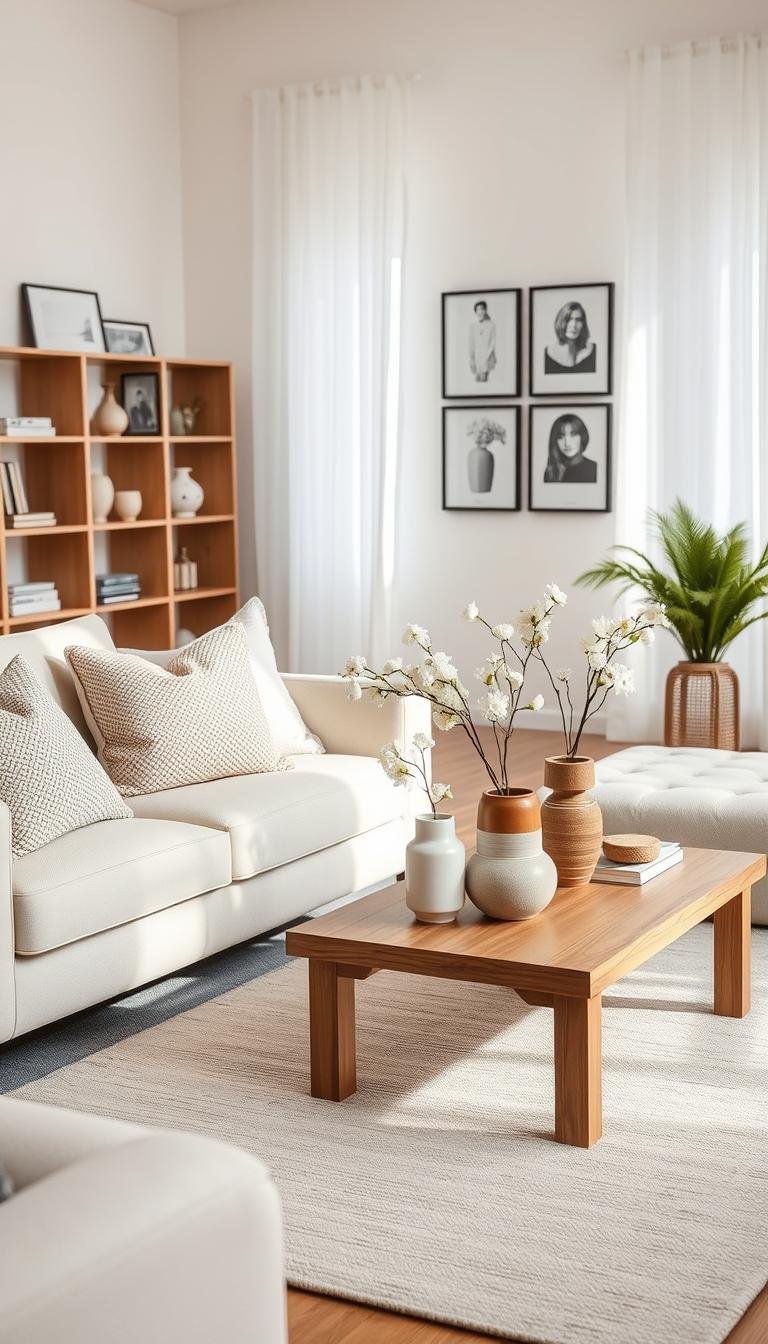
Recommendations prioritize real-life limits: renter-friendly fixes that avoid wall damage, small-space solutions for scale and storage, and seasonal updates that still read as timeless. The core idea: neutrals win when layered with texture, material, and shape—not when everything matches.
Readers will find sections on textiles like rugs and curtains, wall options such as removable wallpaper or limewash looks, and finishing touches like wood accents, metals, and mirrors.
Start by building a base palette, then add depth with darker neutrals and black-and-white statements to refine the room’s aesthetic and design.
Key Takeaways
- Neutral schemes can look unfinished; layering fixes that.
- Each pick includes who it fits, what it solves, and buying checks.
- Solutions favor renters, small spaces, and seasonal updates.
- Texture, form, and material matter more than matching hues.
- The guide covers textiles, wall options, and finishing touches.
What “Neutral” Really Means in Design (and Why It Doesn’t Have to Look Flat)
Knowing what counts as a neutral tone makes shopping faster and less risky. For purchasing, define a neutral color as a low-saturation tone that pairs easily across seasons and styles.

Core anchors include white, cream, beige, tan, gray, greige, and taupe. Each reacts to light and surrounding materials differently, so test samples in the room before you commit.
The most common problem is sameness: when every surface matches, the space reads blank instead of intentional. Designers solve this by using a simple framework: texture, pattern, and shape.
- Texture: add nubby weaves, boucle, and natural fibers to create depth.
- Patterns: choose one or two tone-on-tone motifs; keep the motif scale right for the room.
- Shape: mix curves and oversized silhouettes to break linear sameness.
Use black as a grounding accent—frames or hardware—so the palette stays cohesive. Treat olive green as a repeatable hint color when it echoes foliage; one sofa plus a pillow or two is enough.
| Category | Effect | Maintenance |
|---|---|---|
| Warm neutrals | Cozy, lived-in | Hides wear |
| Cool neutrals | Crisp, modern | Shows dust |
| Dark neutrals | Add depth | May shrink small rooms |
| Nature neutrals | Organic, earthy | Works with plants |
How to Choose a Neutral Palette That Feels Cozy, Not Cold
Start by testing textiles and paint together so the room reads warm in every light.
Many rooms feel cold because undertones clash. A cool gray beside a warm beige can make the space look off. Often there is also not enough material warmth from wood, woven rugs, or soft seating.
Warm undertones for a lived-in feel
Favor creams, beiges, tans, browns, and greige for large pieces like sofas and area rugs. These tones add depth and make a living room feel inviting. Use warmer fabrics on seating and big textiles for instant comfort.
Balancing warm and cool in small spaces and apartments
Choose one temperature as the lead and the other as a supporting accent. For example, pick warm as 60% (walls or large textiles), cool as 30% (throws, art), and 10% dark for contrast.
- Spot undertones by comparing swatches side-by-side in daylight and evening light.
- In low-light apartments, avoid cool grays that read blue; creams brighten without starkness.
„Let materials—wood, woven textures, and brass—rescue a scheme that feels sterile.“

| Issue | Quick fix | Buyer tip |
|---|---|---|
| Clashing undertones | Match swatches in the room | Order samples before large purchases |
| Cold, clinical look | Add warm textiles and wood accents | Choose warm-leaning sofas or rugs |
| Poor apartment light | Use warm wall tones and mirrors | Prefer cream linens and lightweight throws |
best neutral home decor for Renters and Small Spaces
In tight apartments, quick swaps can transform a room without risking a deposit. Renters often face limits: no painting, few drill holes allowed, and tight square footage that amplifies mistakes.

- Rugs sized to anchor seating—measure first to avoid a floating look.
- Floor-to-ceiling curtains for height without hardware damage (tension rods work).
- Peel-and-stick wallpaper or removable murals for a statement wall.
- Slipcovers and plug-in lamps to change the living base quickly.
What to prioritize in small space
Choose scale and multi-use pieces. A storage ottoman replaces a coffee table and hides clutter. Add mirrors or low-gloss metal to reflect light and expand the feel of a room.
Quick checklist before buying
- Rug size, then window treatments.
- Wall treatment, then accents.
- Spend on rug and sofa cover; save on small decor and seasonal textiles.
Seasonal swaps: trade pillow covers and throws in warmer or cooler tones to update the look while keeping the same base. Always confirm measurements and return policies before ordering for an apartment or small space.
Neutral Area Rugs That Add Texture and Define the Living Room
A well-chosen area rug can instantly anchor an open-plan living room and give each zone a clear purpose.

Problem solved: open layouts often feel scattered and a neutral palette can read flat. A rug adds texture and defines a seating area without changing wall color.
Who this suits
Best for open-plan living rooms that need clearer zones, renters who want a temporary upgrade, and anyone aiming for a layered, modern living room look.
Buying considerations
- Pile height: low-pile for easy vacuuming and doors; plush for comfort but check clearance.
- Fiber: wool or synthetic blends for durability and stain resistance.
- Tone-on-tone variation: choose subtle stripes, small geometrics, or natural weave to avoid a one-note surface.
Pros and cons
| Type | Pros | Cons |
|---|---|---|
| Low-pile rug | Easy care, works with high traffic | Less cushioned |
| Plush rug | Cozy, tactile warmth | Shows footprints, tricky in tight doors |
| Layered over carpet | Adds texture, defines zone | Might shift without a pad |
Small-space sizing tips
At minimum, place sofa front legs on the rug. In very compact rooms, use a larger rug to make the space feel unified rather than letting furniture look like it’s floating.
„Choose tone-on-tone patterns and varied pile to keep a neutral scheme lively and durable.“
Affiliate-ready blocks: consider categories like low-pile for pets, washable options, budget patterned choices, and plush comfort picks when comparing products.
Linen or Cotton Curtains in Cream and Taupe for Softer Light and More Height
Choosing the right curtains gives soft light control and a taller sense of space without construction.

Who this suits
Ideal for apartments with harsh daylight or low ceilings. Cream and taupe panels tame glare and add a warm, subdued layer to a living room or bedroom.
Buying considerations
Decide opacity first: sheer for filtered light, privacy for daytime screening, blackout for sleep and insulation.
- Choose liners when you need extra privacy or thermal performance.
- Check hardware: tension rods work for renters; confirm bracket size if drilling is allowed in an apartment.
- Pick materials that match the room’s texture—linen for tactile depth, cotton blends for easy care.
How to create height and order panels
- Hang the rod 4–6 inches above the frame and extend it 6–12 inches past each side to make windows read taller.
- Order panels that skim the floor; long panels calm a small space and finish the look.
- For fullness, aim for 1.5–2x the window width; two panels often cover one window well in a living room.
Pros and cons
| Fabric | Pros | Cons |
|---|---|---|
| Airy linen | Soft texture, breathable, elegant look | Wrinkles easily; lighter privacy |
| Heavier weave | Better insulation and blackout | Can weigh down small rooms visually |
Coordinate undertones with the rug and sofa rather than chasing wall paint. Taupe and cream tones read differently in each light, so sample before you buy.
„Hang rods higher and wider than the frame to make ceilings look taller and daylight feel softer.“
Product blocks to consider: linen-look budget panels; true blackout panels in neutral tones; no-drill tension rod kits for renters.
Scenic Wallpaper or Removable Murals for a Neutral Room That Isn’t Boring
A softly printed landscape can give a room depth while keeping a restrained palette. Scenic wallpaper or mural-style prints rescue blank beige walls that feel unfinished. They add texture and visual distance without bright pigments.

Who this suits: renters and small-apartment dwellers who want a calm focal wall in a living room or dining nook.
- What works: muted botanical scenes, sepia landscapes, or taupe linework that reads like texture from across the room.
- Why it helps: scenic prints create depth and a soft horizon to visually expand tight spaces.
Renter-friendly buying checks
- Confirm „removable“ and „repositionable“ claims and order a sample first.
- Check compatibility with matte paint versus textured walls.
- Note adhesive windows: long-term stick can become harder to remove.
„Suzanne Rheinstein used a mural in a New York apartment to create a bucolic oasis.“
Installation reality: plan panel alignment, have trimming tools ready, and test one strip before committing to a full wall.
Where to place it: behind the sofa, in a dining nook, or beside a fireplace for calm focal interest.
- Affiliate-ready picks: „Best peel-and-stick scenic mural“
- „Best neutral botanical wallpaper“
- „Best tools kit for clean installation“
Limewash and Plaster-Look Finishes for Earthy, Cavelike Warmth
Textured wall finishes give off-white rooms a lived-in, cave-like warmth without adding color.
Problem solved: plain off-white paint can read stark in bright or uneven light. A limewash or Venetian plaster effect introduces soft variation so surfaces feel intentional.

Who it suits
- Long-term renters and homeowners who want depth without changing the palette.
- People aiming for a cozy, earthy living space with low color commitment.
Buying and maintenance
Check sheen: matte keeps a natural look; a slight sheen makes cleaning easier.
Patchability: textured finishes hide flaws but can be tricky to touch up.
Daylight vs lamplight: test a swatch—texture reads warmer by lamp and more varied by daylight.
„Texture changes how a neutral reads; it creates depth while keeping the color simple.“
| Feature | Advantage | Drawback | Renter alternative |
|---|---|---|---|
| Limewash paint | Subtle mineral variation, breathable | Needs layering, less washable | Peel-and-stick limewash-look wallpaper |
| Venetian plaster | Dramatic depth, luxe finish | Pro install often required | Textured removable panels |
| Painted texture glaze | DIY-friendly, budgetwise | Can look synthetic if rushed | Sample panels to test |
Quick application plan
- Order samples and apply a 2×2 ft test patch.
- Prep: clean, prime, and repair surface for even texture.
- Decide DIY vs pro by reading kit instructions and trial results.
Affiliate-ready picks: „Best limewash paint kit,“ „Best plaster-look alternative,“ „Best prep tools for smooth results.“
Wood Accents That Warm Up a Neutral Space Without Clashing
Wood details bring an instant layer of warmth that prevents a room from feeling like a staged showroom. They work especially well in a neutral living room that reads too new or flat.

Who benefits and what this fixes
Ideal for renters and anyone with cream or greige upholstery. Adding wood accents fixes a sterile look and adds tactile interest without shifting the palette.
Buying considerations
- Decide whether to match wood tones for a calm feel or mix finishes for a layered, collected look.
- Keep the mix controlled: repeat one tone at least twice (for example, coffee table + frame).
- Consider materials and budget: real wood for longevity, veneer for cost savings, wood-look pieces for renter-friendly options.
Pros and cons at a glance
| Type | Pros | Cons |
|---|---|---|
| Solid wood | Depth, repairable, lasts years | Higher cost, heavier |
| Veneer | Affordable, looks like real wood | Less durable over time |
| Wood-look alternatives | Lightweight, renter-friendly | Can read less rich up close |
Small-space picks and floor coordination
Choose compact side tables, stools, trays, and picture frames to add warmth without crowding the space.
To avoid clashing with existing floors, match undertones (red/orange vs. ashy) and use a rug as a buffer when needed.
„Repeat one wood tone twice to make a mixed finish look intentional.“
- Affiliate-ready picks: „Best light wood side table,“ „Best walnut-tone accents,“ „Best budget veneer console,“ „Best wood-look storage ottoman.“
Brass, Bronze, and Copper Details That Make Neutrals Feel Finished
Brass, bronze, and copper act like punctuation marks in soft color schemes—they define without loud color shifts. These metal accents warm cream and beige palettes and add instant contrast in a subtle way.
Who this suits: people who want a polished look without adding bold paint or upholstery. Small apartments benefit from lamps, curtain rods, picture frames, and small trays that add sparkle without clutter.
- Problem: cream and beige rooms can seem “almost done” and need contrast to read intentional.
- Coordination rule: choose one dominant metal and one secondary metal max to keep the palette calm.
- Renter notes: prefer plug-in sconces, table lamps, and removable hardware overlays instead of permanent changes.
Buying considerations
Decide between lacquered and unlacquered finishes. Lacquered pieces resist patina and fingerprints. Unlacquered metals age into a warm patina but need more wiping and may show smudges.
„Warm metals brighten a room and photograph well, but polished surfaces do require quick upkeep.“
| Feature | Lacquered | Unlacquered |
|---|---|---|
| Maintenance | Low—wipe with damp cloth | Higher—polish or let patina develop |
| Look over time | Stable shine | Soft, aged finish |
| Fingerprint tolerance | Good | Shows prints |
Affiliate-ready picks: „Brass floor lamp,“ „Bronze curtain rod,“ „Copper accent tray.“

Mirrors and Gilt Frames to Brighten Neutrals and Expand Small Rooms
A single reflective surface can change how a small space reads in both daylight and lamp light.
Problem: dim apartments and narrow living rooms often make pale palettes feel flat. Mirrors fix that without altering paint or big furniture.
Who it helps
Ideal for a compact living room or an entry that needs visual depth. Use mirrors when adding light and scale is the priority.
Buying considerations
- Scale: choose a mirror that fills at least half the wall to avoid looking lost.
- Shape: arched frames soften; rectangular shapes modernize the look.
- Frame tone: match with brass, bronze, or wood accents already in the room.

Placement and renter-friendly hanging
- Opposite a window for maximum bounce light.
- Lean a tall mirror against the wall if drilling is restricted.
- Hang behind lamps to create a layered glow.
„Gilt mirrors add an enigmatic luxe to moody schemes while increasing perceived space.“
| Frame | Effect | Renter option |
|---|---|---|
| Brass | Warm, polished accent | Lightweight mirror with damage-minimizing hooks |
| Bronze | Subtle, aged depth | Small wall anchors or leaning option |
| Wood / wood tones | Organic warmth and texture | Command hooks or floor-leaning mirrors |
Pros: brightens and visually expands a room. Cons: mirrors show clutter, so pair with simple storage and tidy surfaces.
Affiliate-ready picks: oversized leaning mirror; arched mirror for small spaces; gilt frame for warm palettes.
All-White and Off-White Layers That Still Feel Practical
All-white schemes can read calm and flexible—but they must work for everyday life. Layering off-whites with varied textures and durable materials keeps a room serene without asking owners to live cautiously around stains and pets.
Best for: creating a serene look that adapts across seasons in a living room or small spaces. Off-white layers let throws, rugs, and accents shift with weather and style without replacing major pieces.
Buying considerations: prioritize washable slipcovers, performance fabrics, and removable pillow covers. Choose matte ceramic accents and plaster or limewash details to add glow without color. Test swatches in both daylight and lamplight to check tones and undertones.
Stain visibility: bright whites show marks fastest. Creamy whites hide everyday wear better while still reading light and clean. For families or pets, opt for machine-washable textiles and rugs labeled for heavy traffic.
Layering recipe: start with a textured rug, add a lightweight performance sofa cover, then mix pillow weaves and a matte ceramic tray. Repeat one darker anchor—black frame or walnut leg—to stop the palette from floating.
| Feature | Advantage | Drawback |
|---|---|---|
| Bright white | Crisp, modern, very bright | Shows stains, can read cold in cool light |
| Off-white / cream | Forgiving with wear, warmer glow | Can look yellow with warm undertones nearby |
| Performance fabrics | Washable, durable for families | May feel less luxe up close |

„Layered whites work when materials vary—plaster, linen, and matte ceramics add dimension without adding color.“
Slipcovered Seating and Neutral Upholstery for Real-Life Durability
Durable upholstery choices let a living room stay calm and collected even with kids or pets.
Problem: upholstered seating is costly to replace, and pale schemes show wear quickly. Slipcovers and sturdy textiles solve that by making refreshes affordable and fast.
Who benefits
Ideal for renters, pet owners, and any high-traffic living spaces where ease of cleaning matters.
Buying considerations
- Choose fabric: linen, velvet, or blended performance textiles; note weave tightness for snag resistance.
- Check cushion support so comfort holds up in daily living.
- Pay attention to shape and scale—a designer silhouette with slim arms and raised legs keeps small rooms feeling open.

Care and maintenance
Opt for removable covers that machine-wash, darker slipcovers where pets live, and fabric protectors for spills.
Velvet vs linen: quick pros and cons
| Fabric | Pros | Cons |
|---|---|---|
| Velvet | Plush look, adds depth | Shows crush marks, attracts pet hair |
| Linen | Airy texture, youthful, breathable | Wrinkles easily, can stain if untreated |
| Performance blend | Durable, stain-resistant | May feel less luxe up close |
„Choose removable covers and a tight weave to keep neutral living pieces working hard and looking intentional.“
Affiliate-ready picks: slipcover sets, fabric protectors, and cushion-support inserts to extend lifespan.
Taupe, Greige, and Ombré Neutrals for Anyone Who “Can’t Commit”
A taupe or greige piece can act like a translator between honey woods and steel-gray accents. These bridge tones help a room with mixed finishes feel intentional without a full redesign.
Best for: rooms that pair warm wood tones and cool gray elements and need a single textile or rug to unify the look.
How to shop for bridge tones
Look for samples in both daylight and evening light. Balanced undertones that avoid strong pink, yellow, or blue shifts are safer picks.
Easy wins include an ombré curtain, a gradient pillow, or a rug that blends multiple hues so one piece contains the mix.
Pros and cons
- Pros: reduces clashing, simplifies swapping accents later.
- Cons: can read muddy if paired with many competing undertones.
| Undertone | How it reads | Quick check |
|---|---|---|
| Warm-leaning | Gives warmth to floors | Looks richer by lamp |
| Cool-leaning | Matches gray accents | Looks bluer in daylight |
| Balanced | Bridges wood and gray | Stable across lights |
Simple matching tactic: tie the bridge color to two fixed elements (for example, floor + sofa) so the room reads cohesive.

„Choose blended textiles that contain multiple tones so one purchase resolves an entire color scheme.“
- Affiliate picks: „Best greige rug,“ „Best taupe curtain,“ „Best ombré neutral accent.“
Moody Charcoal and Gray Pieces for Depth in a Neutral Color Scheme
Darker grays act like anchors that stop a room from feeling washed out or one-note.
Problem: a pale color scheme can lack depth, but bold color may not suit the renter or the designer’s intent. Moody charcoal and deep gray pieces add contrast while staying restrained.
Who this suits: anyone with a modern living room who wants visual weight without full repainting. Use charcoal when the goal is contrast, not color change.

Placement and buying considerations
- Keep ceilings and most walls light; place dark pieces low—rug, sofa, or media console—to anchor the space.
- Use one dark focal element (for example, a mantel or accent chair) rather than many small dark items in a compact room.
- Repeat dark accents—frames, lampshades, or textiles—so contrast feels intentional, not heavy.
Pairing with a fireplace
Dark tones ground a fireplace wall or surround. Balance that weight by keeping adjacent walls and major furnishings lighter so the living room reads open.
„Moody grays give a modern living room depth without adding color.“
| Type | Effect | Notes |
|---|---|---|
| Charcoal rug | Anchors seating, hides wear | Place under front legs of sofa |
| Gray throw & textiles | Adds layer without bulk | Repeat across pillows and lamps |
| Dark accent table / smoky glass | Luxe contrast, reflective depth | Use near fireplace or console |
Pros: sophisticated, conceals light wear. Cons: can show dust and darken low-light apartments.
Affiliate-ready categories: charcoal rugs, gray throw blankets, dark accent chairs, smoky glass lamps. For small spaces, prefer one strong dark piece and small repeated accents elsewhere to avoid shrinking the room.
Black-and-White Statements That Still Read Timeless and Neutral
A single high-contrast element can stop a pale living space from feeling unfinished and give the eye a place to rest.
The common problem: an all-white room often lacks a focal point. Without one, the main seating sightline or fireplace wall can feel like an afterthought.
Who this suits: anyone seeking definition and a modern living impact while keeping a calm palette.
Focal options by commitment level
Low commitment: oversized black frames or a removable mural behind the sofa. These use renter-friendly hooks or peel-and-stick backing.
Medium commitment: a high-contrast textile or a graphic area rug to anchor the seating area.
High commitment: a jet-black Venetian plaster chimney breast or a painted feature wall for homeowners who can alter the surface.

Renter-friendly swaps and balance rules
- Use damage-minimizing hooks for an oversized gallery wall instead of nails.
- Concentrate black on one wall or the fireplace and echo it once or twice elsewhere—a lamp or a slim frame.
- In small rooms, create one vertical black moment rather than scattering accents around the space.
„A focused black element reads modern living when paired with clean lines and tidy surfaces.“
| Option | Commitment | Key benefit |
|---|---|---|
| Removable mural / peel-and-stick panel | Low | Big visual change, renter-safe |
| Black-and-white area rug | Medium | Anchors seating and hides wear |
| Venetian plaster chimney breast | High | Permanent focal point, dramatic fireplace look |
Pros: high contrast reads timeless and photographs well. Cons: it can emphasize clutter and requires clean lines to look intentional.
- Affiliate blocks to consider: black picture-frame set; black-and-white area rug; peel-and-stick graphic panel.
- Mini checklist for a fireplace-wall focal: measure, choose one strong black element, echo once in accessories, keep surrounding surfaces tidy.
Conclusion
Wrap the room with texture and a few deep anchors so a pale palette reads purposeful. This approach keeps a living room from feeling flat and gives designers and shoppers a clear framework to follow.
Start with large surfaces: rug, curtains, then add wall depth with a removable mural or limewash look. Finish with wood accents and warm metals, and place a mirror to boost light. These living room ideas echo Elle Decor features in New York that rely on texture, form, and measured contrast.
Choose your path: small-space owners prioritize scale and reflected light; renters favor removable swaps; seasonal decorators layer textiles. Trust designer rules from New York City projects to guide proportion and tone.
Before buying, test undertones at home. Quick checklist: confirm rug size, curtain length, wood tone match, and at least one dark neutral for depth.
With the base set, there are plenty of small swaps—pillows, throws, art—that refresh a space without restarting the whole room.

One Comment