Problem: Many people want a fresh, brighter living area after winter but do not want to repaint or buy new furniture.
This short guide shows small, renter-friendly swaps that make a big visual impact. It focuses on targeted pieces you can store easily and reuse. The advice suits tight apartments and casual households.
Solution: Use a neutral base and add one spring palette in small doses. Think lighter textiles, simple bouquets, a few art swaps, and neat vignettes with trays, books, and candles. Faux florals are covered, with clear pros and cons for when to choose them.
The article is a practical listicle. Each category—pillows, textiles, florals, vessels, art, greenery, and tabletop styling—notes who it helps, the problem solved, and what to check before buying.
Expect comparison tables (real vs. faux flowers, linen vs. cotton, styling formulas) and product-ready recommendations that favor value, reliability, and rental-friendly options in the United States.
Key Takeaways
- Brighten the room with small swaps instead of big renovations.
- Choose one spring palette and repeat it for cohesion.
- Prioritize items that store well and suit renters.
- Compare real and faux florals for maintenance and allergies.
- Look for damage-free hanging and compact-friendly pieces.
What makes spring living room decor “work” in real homes
Small, strategic switches clear the visual weight that winter furnishings leave behind. Dark textiles, dense layers, and seasonal clutter can make a room feel smaller and dated.
Common pain points include crowded surfaces, dim corners, and a palette that no longer matches brighter natural light. These add to a heavy, busy feeling in a home.

The practical fix
Swap just a few high-visibility items: pillow covers, a lightweight throw, stems or branches, a glass vase, and a fresh print. These pieces refresh color, texture, and light without a full overhaul.
How to spend and where to save
- Spend on a single art piece or quality pillows that set the palette.
- Save with removable options: pillow covers, digital prints, and no-damage hooks.
A cohesion rule
Keep the base neutral, then repeat 1–3 accent colors across pillows, art, and one or two accessories. For small spaces, choose fewer, taller elements (branches or stems) instead of many small objects.
Decision checkpoint: if an item does not reduce darkness, clutter, or heaviness, it is probably not worth storing for the season.
Choose a spring color palette that brightens without repainting
A small, repeatable palette refreshes the space using what already exists. Start by noting the largest, fixed pieces—sofa, rug, or curtains—and build color around them. This avoids any paint or big purchases.

Designer-favorite shades to consider
Soothing greens and soft mineral tones reflect light and feel calm. Dusty pinks act like a gentle neutral for warmth. Soft lilacs pair well with creamy whites and linen.
Crisp alternatives that still read calm
Try light sky blues, teal, or blue-gray for an airy reset. Use warm beige as a foundation to keep the base cozy and adaptable for years.
How to combine colors and materials
Use the simple framework: one neutral foundation (warm white or warm beige), one main accent (green, blue, or teal), and one optional pop (dusty pink or lilac).
- Pair accents with natural woods, linen, rattan, and ceramics to soften saturation.
- Choose unlacquered brass or warm metal details for subtle glow without competing with color.
„Designers recommend soft mineral greens and gray-greens for freshness and light reflection.“
Practical tip: keep large pieces neutral so accents can be swapped seasonally and still work for years.
Best spring living room decor: quick-swap pieces with the biggest impact
Focused updates that pack visual punch are the fastest way to brighten a small home. Start with a ranked checklist to guide buying and storage decisions.

Highest-impact swaps (ranked)
- Pillow covers — store flat, change color quickly.
- Light throw or curtains — swap heavy textiles for airier fabrics.
- Florals or tall stems — one arrangement gives vertical interest.
- Vessels and bowls — group for a tidy focal point.
- Art and digital prints — removable, renter-friendly color.
- Tabletop styling — limit accents to keep surfaces usable.
Small-space vs renter priorities
For compact areas, choose items that read from across the space: a set of pillows, one tall vase, and a single artwork set. This avoids scattered clutter.
Renters should pick no-damage hooks, downloadable prints sized to standard frames, and pieces that store flat or nest. Keep seasonal boxes compact.
| Need | Top Picks | Storage |
|---|---|---|
| Small space | Pillows, tall stems, single artwork | Flat, vertical storage |
| Rental | Digital prints, removable hooks, cushion covers | Flat or stackable |
| Quick refresh | Throws, vases, a bud set | Small bins, nested |
Clutter guardrail: cap seasonal pieces to two per surface so the living area stays functional. Place color where it counts: the entry sightline, coffee table, and main seating zone.
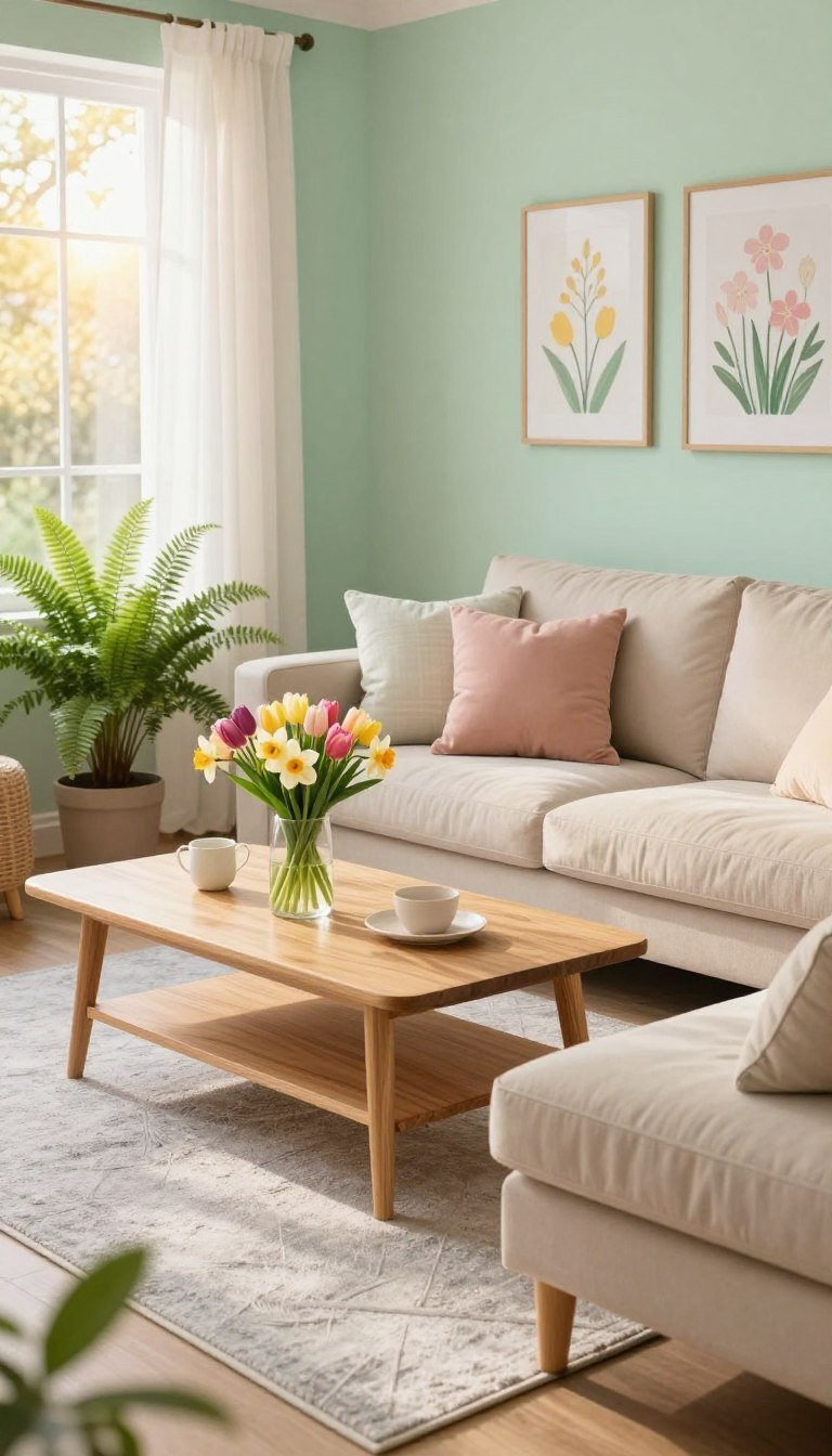
Throw pillows and covers that instantly reset the room
A quick pillow swap is the fastest way to shift a room’s palette without new furniture.

Who this helps: Neutral sofas that feel flat after winter. Two to five coordinated pillow covers lift the seating area and store flat once the season ends.
Buying considerations
Mix sizes: larger back pillows plus smaller accents give depth and scale.
Choose quality inserts for fullness; low-fill inserts look limp and flatten the look.
Avoid tiny patterns that disappear from across the space. Readable scale keeps the color story clear.
Fabric and care
Linen and cotton read light and breathable for spring touches and wash well. Velvet can work but often reads heavy and shows pet hair.
Pros and cons and styling rule
- Bold color: adds energy but can feel busy in daily-use areas.
- Muted tones: calm, versatile, and easier to keep year-round.
- Cohesion tip: pick the palette from your pillows first, then repeat those colors in one artwork, one vase, or one accessory for a pulled-together style.
| Need | Product idea | Problem solved |
|---|---|---|
| Flat sofa | Best linen pillow covers | Refreshes color without new furniture |
| Mismatched tones | Best patterned cover for hiding wear | Unifies scattered colors |
| Floppy cushions | Best budget insert upgrade | Restores shape and light bounce |
Lightweight textiles that replace winter heaviness
Lighten fabrics on key surfaces to reduce darkness and invite more daylight. Thick throws and heavy drapes trap visual weight and make a space feel smaller after winter.

Best for: rooms that feel warm, dark, or visually heavy. These swaps are renter-friendly and usually require no tools or paint.
What to swap first
Start with the throw. A lighter blanket changes the sofa’s scale and stores flat when not in use.
Next, refresh curtains if they block light. Choose lighter colors to reflect daylight without sacrificing privacy.
Consider slipcovers only if upholstery looks worn. They add seasonal protection and are easy to remove.
Buyer considerations
- Throws: favor breathable fibers, washable care, and muted palette choices that support your chosen accent colors.
- Curtains: pick easy-install hardware for renters and balance privacy with light by layering sheers under heavier panels.
- Pets and kids: blends often hide wear and are simpler to clean; pure linen looks elevated but wrinkles more.
„Designer guidance: warm linens and creamy whites reflect light and pair well with natural woods for an airy, grounded look.“
Comparison: linen vs cotton vs blends
| Fiber | Hand-feel | Wrinkles | Maintenance | Price/value |
|---|---|---|---|---|
| Linen | Textured, airy, elevated | High—natural linen softens with wear | Gentle wash, air-dry recommended | Mid–high; long-lasting and stylish |
| Cotton | Softer, smooth, breathable | Low–medium; depends on weave | Machine-washable; easy care | Low–mid; great value for frequent washing |
| Blends (cotton/poly or linen blends) | Soft with structure | Low; more forgiving | Machine-washable; durable | Mid; practical for households |
Affiliate-friendly picks: „Best linen-look curtains for renters,“ „Best lightweight throw for a sofa refresh,“ and „Best slipcover option for seasonal updates“ suit different budgets and use cases. Choose pieces that store easily and support the overall palette for the season.
Spring florals that look fresh all season (real and faux)
Introducing seasonal blooms adds immediate color and a subtle, natural transition for the home.

Why flowers work: A bouquet signals season change without replacing furniture. Stems add height, texture, and an easy color touch that reads across a small space.
Real flowers: quick plans for busy households
Buy grocery-store bouquets weekly for steady refreshes. Tulips are affordable and low-fuss; a single bunch brightens a coffee table or console.
Who should choose real: People who enjoy weekly upkeep and want the lowest upfront cost.
Faux flowers: keep arrangements believable
Use faux only for blooms that would be in season outdoors. This „in-season only“ rule keeps arrangements authentic and avoids the fake look.
Who should choose faux: Allergy sufferers, frequent travelers, or households that prefer no maintenance.
- Pros of real: natural scent and high realism; lower initial cost but ongoing replacement.
- Pros of faux: reusable and low-maintenance; higher upfront cost and requires dusting.
- Safety: check pet toxicity for real stems and pick non-shedding materials for faux pieces.
| Feature | Real flowers | Faux flowers |
|---|---|---|
| Maintenance | High — water changes, trim stems | Low — dusting occasionally |
| Realism | Excellent while fresh | Varies — choose lifelike materials |
| Cost over a season | Low upfront, recurring purchases | Higher upfront, reusable |
| Allergy & pet friendliness | May trigger allergies; some types toxic to pets | Good for allergies; check shedding and materials |
| Storage | Minimal — compost or discard | Requires boxes and care to avoid crushing |
Affiliate picks: a budget tulip bunch, a realistic faux-stem set, and a versatile bud vase make an efficient starter kit for seasonal color.
Statement branches and blooming stems for height without clutter
A single tall arrangement can change how a small space feels without filling every surface. This approach solves the common small-space problem: many tiny spring items create visual clutter. One vertical piece adds interest with minimal fuss.

Who benefits and where to place them
Best for: compact seating areas that need height—mantels, empty corners, and narrow consoles. A tall grouping reads from across the sofa and removes the need for multiple small accents on a table or shelf.
Styling example and a natural alternative
Source-backed idea: faux cherry blossoms arranged in an oversized ginger jar create a statement without extra pieces. The effect is high-impact and low-clutter.
Natural option: force flowering branches indoors by cutting stems when buds swell. These give authentic seasonal color if the household can manage light upkeep.
Buying and storage notes
- Choose stems long enough for floor or console placement; measure vase height before buying.
- Prefer bendable wire cores for shaping and low-shedding blossoms to cut cleanup.
- Store stems flat or in a long bin; disassemble or gently bend stems to avoid crushed blooms.
Affiliate-ready picks
- „Best faux cherry blossom stems“ — for low-maintenance statement pieces.
- „Best oversized jar/vessel for tall stems“ — anchors height without extra accents.
- „Best budget branch bundle“ — an affordable natural or faux starter set for small spaces.
Vases, ginger jars, and bowls that anchor your spring decor
A single well-chosen vessel can instantly make a table feel finished and intentional. Vessels create structure and make styling easier because they “hold” florals, branches, or even stand alone as a sculptural anchor.

Best for quick fixes on coffee tables and sideboards
If a coffee table or sideboard looks unfinished, one large jar plus a smaller companion often solves it. The large piece adds height; the small piece adds scale and balance. Use a decorative bowl for keys, fruit, or seasonal fillers to add color without clutter.
Material guide: glass, ceramic, metal
Glass reflects light and feels airy. It suits table placements that benefit from glow but can break in busy homes.
Ceramic adds softness and weight. It stays put near pets or kids but is heavier to store.
Metal brings subtle sheen and high durability. It resists chips but can scratch and read more formal.
What to buy: a practical starter trio
- One large vessel for stems or a ginger jar as a statement anchor.
- One bud vase set for small spreads and tight spots.
- One decorative bowl for keys, fruit, or seasonal accents.
| Material | Light | Durability | Storage |
|---|---|---|---|
| Glass | High | Fragile | Flat box or padded |
| Ceramic | Soft | Stable | Stack carefully |
| Metal | Reflective | Resilient | Compact nesting |
Small-space tip: choose nesting bowls and a compact bud set for easy storage. Match vessel materials to your palette—warm whites, natural wood, or brass accents—so the table reads cohesive and intentional with one subtle touch.
Wall art and printable downloads for renter-friendly color
Digital downloads let renters introduce seasonal art with almost no cost or commitment. They solve the common problem: blank walls and dull winter neutrals without repainting. Downloads are easy to swap and print in standard sizes from a local shop or an online lab.

Practical buying and sizing guide
Choose a single frame family (for example, 11×14 and 16×20). Use mats to make mixed sizes feel cohesive. Pick prints that repeat one or two accent colors from pillows or a vase.
How to plan a mini gallery
- Limit styles to two (abstract and botanical, for example).
- Keep spacing consistent—3–4 inches between frames.
- Place the set on the main seating wall, above a console, or near the entryway sightline for maximum impact.
Pros and cons
| Option | Cost & flexibility | Texture & upkeep |
|---|---|---|
| Digital prints | Low cost, reusable, size-flexible | Flat paper; print quality varies |
| Original art | Higher cost, unique presence | Richer texture; care needed |
| Textiles/wall hangings | Moderate cost; tactile | Adds warmth; can collect dust |
Renter-friendly hanging: use removable hooks or lightweight frames to avoid damage to the wall. For quick swaps, keep a small kit of frames and a set of downloadable prints from Etsy or similar sellers. This approach adds color and intent without long-term commitment.
Greenery and spring organics for a natural, calm reset
One tall stem, a low moss bowl, and a potted fern can change how a home feels at a glance.

Neutral schemes often read sterile. Adding living or lifelike greenery gives texture and a calming touch without new paint or furniture.
Easy wins and placement
High-impact picks: one potted fern for soft foliage, a decorative moss bowl for low-profile texture, and a single tall branch for height.
Place a fern beside seating, the moss bowl on a console, and the tall stem in an unused corner to soften hard lines and lift the sightline.
Real vs faux: practical guidance
- Real plants: need light, watering, and occasional repotting. Choose a low-light plant if window access is limited.
- Faux options: pick pieces with color variation and textured stems. Avoid glossy finishes that read fake.
Faux realism checklist
- Varied leaf tones, not a single flat green
- Visible stem texture and branching points
- Natural leaf shapes and matte surfaces
| Type | Maintenance | Storage |
|---|---|---|
| Real | Water, light, periodic trimming | Small pots; easy to rehome |
| Faux | Dusting, occasional reshaping | Flat boxes; protect leaves |
Small-space guardrail: choose a few larger pieces rather than many tiny pots that clutter surfaces. This strategy keeps the space calm and purposeful.
Affiliate-ready suggestions: a low-light plant option, a realistic faux fern, and a decorative moss bowl suit different care levels and home conditions.
Tabletop styling that looks intentional (even in tiny spaces)
A compact tabletop plan helps a small space look styled without losing everyday function. Surfaces collect clutter fast, and a consistent formula keeps a living area tidy and attractive.

Create a simple vignette with four reliable pieces
Recipe: one tray to contain items, one candle for warmth, 1–2 stacked books for height, and a single seasonal accent (small vase, bud vase, or bowl).
Why it works: the tray makes fast cleanups simple, books add scale, and one accent provides the seasonal touch without overwhelming the surface.
Keep accents minimal to avoid theme overload
Choose a few tasteful items rather than a themed set. Minimal accents look elevated and pack away easily at season end.
In daily-use spaces leave clear zones for cups, remotes, or plates. Use the tray as the reset area to collect small things at the end of the day.
Scale and function by table type
Tiny spaces benefit from fewer, larger objects. Larger rooms can include one extra layer, but keep the palette controlled for cohesion.
| Table Type | Recommended item count | Height strategy | Best vessel size |
|---|---|---|---|
| Coffee table | 3–4 items (tray, candle, books, accent) | Low to mid — stack books for center height | Medium tray (12–16 in) and 6–8 in vase |
| Side table | 2–3 items (candle, small book, bud vase) | Low — keep clear edge for cup or lamp | Small tray (8–10 in) and 4–6 in vase |
| Console table | 3–5 items (tray, taller vessel, book stack, bowl) | Mid to tall — one vertical piece anchors sightline | Long tray (16–20 in) and 8–12 in vessel |
Affiliate-friendly picks: look for practical tray sizes for small tables, candle styles built for daily use, and decorative book sets that store flat. These items help keep dining, living, and dining table surfaces useful and styled.
„Contain, elevate, and limit: a simple vignette keeps surfaces functional and photo-ready.“
Conclusion
Finish the season with a simple plan that trims clutter and boosts light. Focus on a neutral base, one repeat accent, and a short list of high-impact swaps that solve darkness, heaviness, and excess things on surfaces.
Buy in order: pillow covers, lightweight textiles, florals or branches, a single vessel, renter-friendly art, then a small tabletop vignette. This sequence prioritizes cost, storage, and visual return.
Keep cohesion: repeat your accent in two to three spots so the space reads intentional. For renters and small spaces, choose damage-free hangers and items that store flat or nest.
Real flowers and live plants need time and care; faux pieces cut maintenance but should appear seasonally appropriate. Carry one accent into the kitchen or entry with a towel, bowl, or print for whole-home continuity.
Decision lens: if a thing won’t be used often or stored easily, skip it this time. Small, well-chosen updates give a confident, low-effort seasonal refresh.


5 Comments