Summer sun can wear out a room and make small spaces feel hotter. This guide names practical, renter-safe swaps to protect finishes and keep a space visually cool. It frames the problem, sets realistic expectations, and points shoppers to items that balance performance with style.
The promise is simple: a heat friendly decor mix focuses on materials, finishes, and lighting that reduce glare, resist fading, and avoid sticky or warped surfaces. Readers will find options that are easy to install, remove, and store—ideal for apartments and small homes.
Design guidance centers on warm/cool balance. Use a dominant tone and a smaller accent, then add neutral bridge textures like concrete, stone, or glass to tie the look together.
This section previews what follows: a clear definition of “heat-friendly,” a warm/cool color plan, lighting tips, product picks with pros and cons, and a buying checklist. The goal is to help shoppers know what to buy, who each item is best for, and what tradeoffs to expect.
Key Takeaways
- Problem: Intense sun can fade fabrics and make rooms feel uncomfortable.
- Solution: Choose materials and finishes that resist glare and warping.
- Focus on renter-friendly, removable swaps that are easy to store.
- Layer small upgrades for better results than a single big change.
- Expect improved visual comfort, not immunity to extreme sun or heat.
What “heat-friendly” summer decor really means for homes, apartments, and rentals
Strong daylight can change how colors read and how surfaces perform. Heat‑friendly is a buying filter: choose items that resist fading, avoid warping, and keep a bright room feeling calm.

Common summer problems to prevent
UV exposure fades textiles and alters paint tones. Warping happens when hot air hits furniture or poorly finished surfaces. High humidity can make soft finishes feel sticky.
Practical problem → response
- Fade risk → outdoor-grade fabrics or washable slipcovers.
- Glare → light-filtering curtains or peel-and-stick window film.
- Sticky finishes → matte ceramics, stone-look accents, or glass pieces.
Small-space and renter priorities
For renters, choose peel-and-stick, tension rods, and plug-in lighting to avoid damage to walls. For compact spaces, pick lightweight, multi-use items that store under bed or in a closet.
One concrete example: a sunny rental living room can feel hotter from glare. Controlling light and adding cooler anchor tones improves visual comfort without changing the lease. These criteria make it easier to compare things like material, finish, cleaning, weight, and storage when shopping best summer decor for small spaces today.
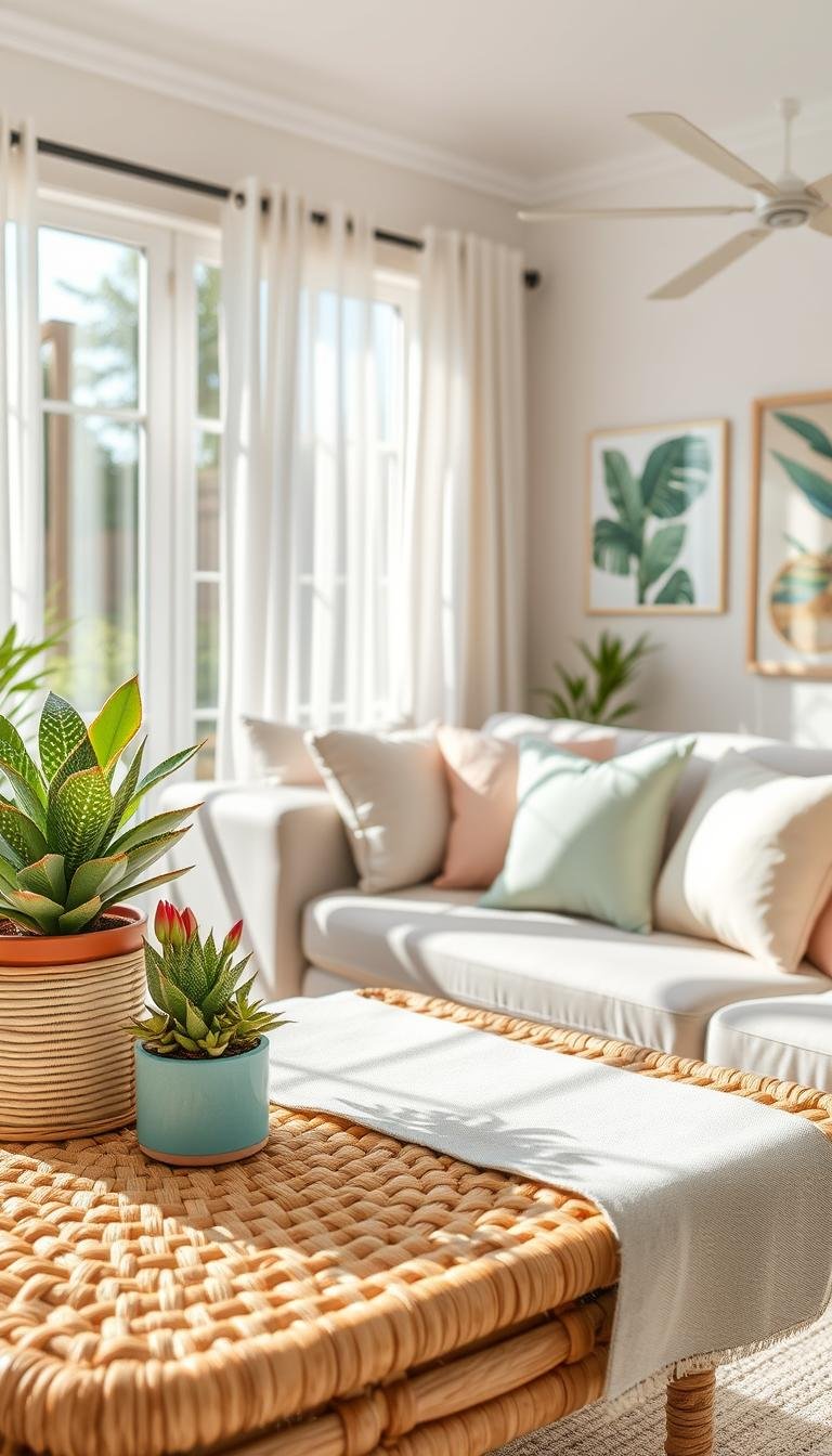
Build a heat friendly decor mix with warm and cool tones that stays balanced
A reliable rule lets homeowners pair warm and cool colors so a room reads calm rather than chaotic.
Why color temperature matters: Cool color fields—blues, greens, and violets—read crisp and can reduce visual glare in bright rooms. Warm colors—reds, oranges, yellows—feel intimate and energetic. Use this to pick the mood you want during sunny months.

Pick a dominant temperature and keep the other as an accent
Choose one temperature for big surfaces: rugs, sofa textiles, or bedding. Make the opposite temperature an accent in pillows, art, or a small lamp.
„Allow one color family to be the star and let the other play supporting roles.“
Use an 80/20 rule for small spaces (practical example)
Example: 80% airy warm neutrals + 20% cool blues in pillows or prints. Or reverse it: 80% cool grays/blues + 20% warm wood and a gold accent. This keeps contrast without visual chaos.
Watch undertones so pieces don’t fight
Undertones make matching tricky. Two beiges can clash if one leans pink and the other leans green. Check items in daylight and again under a lamp.
| Step | What to test | Result |
|---|---|---|
| Dominant surfaces | Rug, sofa, bedding | Choose the main temperature for cohesion |
| Accent pieces | Pillows, art, small lamps | Use opposite temperature sparingly |
| Undertone check | Daylight vs lamp light | Keep uncertain items as small accents |
| Bridge elements | Stone, matte ceramics, woven textures | Help the eye move between warm and cool |
Quick buying tip: Lock in a tight color palette before shopping. It cuts returns and helps seasonal pieces look intentional in compact homes.
Use lighting to control color temperature and keep the room comfortable in summer
A room’s bulbs can make colors feel cooler, warmer, or oddly off. Summer daylight is already bright and leans cool in many homes, so the wrong lamp can make paint, textiles, and skin tones look harsh at night.

Kelvin basics that affect everything you see
Higher Kelvin = cooler/whiter light. Lower Kelvin = warmer/amber light. Changing from 2700K to 4000K can shift wall color noticeably and alter how fabrics read.
When to choose soft white (2700K)
2700K soft white is the safest choice for living rooms, bedrooms, and shared spaces. It flatters skin and furnishings and works with either warm cool palettes.
- Problem: daylight makes rooms feel cool; a cool bulb can feel sterile.
- Rule: match bulbs to the palette you used when sampling paint and textiles.
- Tip: opt for diffusing shades—linen-look or frosted—to avoid direct glare.
Example: a Horizon table lamp with an ombré shade can bridge warm and cool tones in one piece and reduce visual clashes in small rooms.
| Decision | What to look for | Why it matters |
|---|---|---|
| Bulb Kelvin | 2700K for soft white; 3000–3500K for neutral | Controls whether colors read warm or cool |
| Shade | Linen-look, frosted, or dual-tone | Diffuses light and links tones |
| Placement | Side table, bedside lamp, desk lamp angled away | Reduces glare and softens corners |
Next: these lighting choices pair well with renter-friendly plug-in fixtures and the product picks that follow. For more on cozy options, see best cozy lighting for home.
Best heat-friendly summer decor picks that work in small spaces and rentals
This shortlist highlights practical pieces that keep a sunny small space feeling composed and easy to maintain. Use each category to compare material, finish, sunlight exposure, cleaning needs, and renter-friendliness before you buy.

Washable slipcovers and breathable throws
Best for renters and small-space owners who want a living room refresh without new furniture. They solve sweat, sunscreen stains, and fading.
Pros: machine-washable, reversible, easy storage. Cons: fit varies; some fabrics wrinkle.
Outdoor-grade throw pillows
Ideal for direct sun by windows or on a patio. These throw pillows resist fading and wipe clean.
Pros: UV tolerance and durability. Cons: can feel firmer than indoor cushions; may need liners.
Peel-and-stick window film
Great for rentals with harsh glare. It reduces glare and protects rugs, art, and upholstery without permanent changes.
Pros: removable and budget-friendly. Cons: careful installation needed; may dim plant light.
Light-filtering linen-look curtains
Best for rooms that need airflow and softer sun. They diffuse light and stop a washed-out palette from feeling flat.
Pros: breathable, improves visual comfort. Cons: length must be measured; some sheers still pass UV.
| Item | Best for | Quick pro/con |
|---|---|---|
| Concrete/stone accents (Monolith clock) | Balancing warm cool palettes | Matte finish hides wear / heavier if real stone |
| Paper mâché or matte ceramic vase | Small spaces needing light anchors | Lightweight and minimal / can chip |
| Ombré table lamp (Horizon) | Bridging warm and cool tones | Unifies palette / shade must match bulb Kelvin |
Plug-in pendant options and small tables
Plug-in pendant lights give overhead style for renters without hardwiring. Compare cord length, swag hooks, and bulb type.
Choose side tables with sealed wood, metal, or stone-look tops to stage seasonal items and avoid surface wear.
Finish notes: art, walls, and small accents
Pick heat-stable finishes for wall art and clocks to avoid warping. Use gold or brushed metal sparingly to add warmth without overpowering the palette.
For more space-saving ideas and sunroom tips, see small-space apartment ideas, sunroom styling tips, and outdoor cushion options.
Buying considerations to compare before you shop (and what each option is best for)
Smart shopping starts with a side‑by‑side look at materials, finishes, and portability. Shortlist 3–5 options and compare them on the same criteria to avoid returns and clutter.

Best for renters
Choose removable installs: peel‑and‑stick film, tension rods, removable hooks, lightweight wall art, and plug‑in pendant lights. These protect walls and keep deposits safe.
Lease‑safe checklist: patchable holes, minimal adhesive residue, cord length for plug‑in lighting, and light fixtures that don’t require hardwiring.
Best for direct sun
Prioritize fade‑resistant fabrics, UV window film, and sealed surfaces like matte ceramic or stone‑look tops. Fade‑resistant slows fading; it does not stop it.
Best for small spaces
Pick multi‑use furniture: a side table that doubles as storage, a pendant that replaces several lamps, and a tighter color palette to reduce visual clutter.
| Criterion | What to check | Why it matters |
|---|---|---|
| Material | Outdoor fabrics, sealed surfaces | Durability and cleaning |
| Finish | Matte vs glossy | Glare and maintenance |
| Weight & storage | Lightweight, stackable | Easy seasonal storage |
| Lighting | Bulb base, 2700K support, shade opacity | How colors and tones read |
Example: a south‑facing room may need window film plus outdoor pillows first. A north‑facing room benefits more from warm lighting and small wood or gold accents to restore balance.
For a moving‑in checklist and furnishing basics, see the ultimate new home furnishing checklist. For living room edits and styling tips, reference dos and don’ts. For lamp and pendant choices, review summer lighting ideas.
Conclusion
Start the final edit by naming the room’s biggest summer annoyance and targeting it directly. Define whether glare, fading, or visual warmth is the main issue, then pick the most targeted fix: window film, washable textiles, light-filtering curtains, or heat-stable accents.
Keep one dominant direction for color and tones. Use a warm cool strategy: pick a main temperature and limit the opposite as an accent. That focused mix makes small rooms read calm and cohesive.
Use lighting as the final glue. A 2700K soft white bulb keeps the palette and furnishings looking natural at night. Renters win with plug-in lighting and removable window solutions.
Buy smart: compare material, finish, cleaning, weight, and storage before purchasing. These swaps improve durability and visual comfort, but direct sun and high heat still need careful placement and seasonal rotation.