Renters often want personality without risking a deposit. They need depth and texture on a surface yet must respect lease rules. Small rooms can feel crowded if pieces compete, so a clear strategy helps.
Best wall decor mix for apartments means a balanced combination of art, texture, and light that stays cohesive even when pieces change seasonally. Start with an anchor style, limit the palette, vary scale, use consistent frames, and add layering or leaning elements.
This guide previews ten solutions and labels each as best for tiny walls, large focal areas, zero-drill rules, frequent movers, or seasonal updates. Each entry includes pros and cons, what to buy, size guidance, and mounting notes for drywall and plaster.
Readers will leave ready to choose prints, shelves, ledges, mirrors, removable paper, or plug-in lights with clear measurement tips. A quick safety note: check weight limits, use anti-tip for leaning pieces, and confirm lease rules for adhesives and removable coverings.
Key Takeaways
- Renters can add personality while protecting deposits with renter-friendly fixes.
- Use an anchor style and a limited palette to keep a coherent look.
- Combine accent elements (paint or removable paper) with shelves and lighting for stronger results.
- Each idea includes buying guidance, size tips, and mounting considerations.
- Always check weight limits and lease rules before installing.
What Apartment Dwellers Actually Need From Wall Decor
Renters need solutions that add personality without risking their deposit or crowding the room. Practical choices tie each need to a clear purchase or action so decisions stay simple and renter-friendly.
Common renter problems
- Minimize damage: use removable anchors, adhesive hooks, or ledges to cut holes and avoid permanent changes.
- Limited wall space: choose fewer, larger-impact pieces instead of many small items that clutter sightlines.
- Lease rules: favor removable finishes like peel-and-stick and freestanding options to protect the deposit.

Small-space goals
Prioritize adding depth, creating one clear focal point, and keeping sightlines calm.
Seasonal decorating without redoing the whole room
Build a flexible base—neutral paint or peel-and-stick pattern—then swap top layers such as prints, frames, and ledge styling for quick seasonal updates.
„Mirrors reflect light and visually expand a room; removable wallpaper gives pattern without commitment.“
Decision factors to note: wall size, lighting, outlet access, furniture placement, and how much installation effort a renter accepts. The choice that combines function + style—like a mirror for light or a shelf for display—usually wins.
How to Build the best wall decor mix Without Making Your Walls Look Busy
Anchor the room with a single style and let other choices fall into place. Start by picking the dominant aesthetic already in the space—modern, rustic, or traditional—and use it as a filter when shopping. This prevents conflicting purchases and keeps the overall look calm.
Limit the color palette: repeat one or two colors across different pieces so varied artwork reads as intentional. In small rooms this rule saves money and reduces clutter.
Scale and balance
Use one larger statement piece over a sofa or bed. Add smaller supporting pieces elsewhere to guide the eye and create depth.
Frames and finishes
Standardize frames—pick black, wood, or metal—and keep that finish across most pieces. This ties different prints together even when styles vary.
Layering for flexibility
Combine hung artwork with shelves or a leaning oversized print. Shelves let renters swap pieces without new holes.
„If the eye doesn’t know where to land, simplify: reduce colors, repeat one frame finish, or add more white space.“
| Tool | What to standardize | Where to vary |
|---|---|---|
| Palette | 1–2 repeat colors | Pattern and texture |
| Frames | Finish (black/wood/metal) | Matting and scale |
| Layout | Anchor focal point | Supporting sizes and shapes |

Before You Buy: Measure Your Wall and Plan the Layout on the Floor
Outline your wall on the floor to test sizes and avoid costly mistakes. Measuring first supports confident buying and cuts wasted returns. Artifact Uprising and other pros recommend mapping the exact footprint before shopping so pieces suit the room and circulation.
Use painter’s tape to map spacing and avoid unnecessary holes.
Mock the layout with tape
Mark the wall dimensions on the floor with painter’s tape. Arrange each piece inside that outline to test scale. Start with the largest piece first, then add smaller items outward to keep a clear focal point.
Pick a layout style
Choose a grid for tidy order, an asymmetrical arrangement for flexibility, or a closed set to fit tight spaces. Each way changes how the eye moves through the room and how the gallery reads.
- Keep gaps consistent; steady spacing looks calmer.
- Use mats for extra white space when prints feel dense.
- Label tape templates for each frame to transfer positions to the wall with fewer mistakes.
- For very light pieces, consider washi tape to reduce holes, especially in grid layouts.

„Measure, mock, and label — the simple way to prevent wrong sizes and extra holes.“
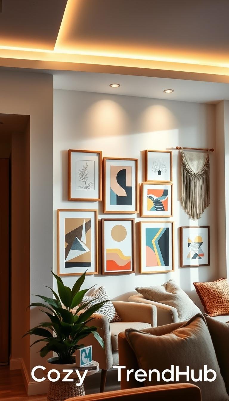
Gallery Wall With a Flexible Layout for Small Spaces
A compact gallery creates maximum visual impact per square foot while keeping other walls calm and uncluttered.
Core problem solved: a gallery wall concentrates personality into one controlled zone so a small apartment doesn’t feel noisy across every surface.
Best-for scenarios
Ideal when styling a living room focal area, a narrow hallway, or the space above a sofa or console that needs one cohesive statement.
Layout options that work in apartments
- Grid: calm, structured, requires precise measuring.
- Asymmetrical: start with a center anchor piece; easy to expand later.
- Mismatched set: eclectic collections unified by one frame finish.
Pros and cons
- Pros: high impact per square foot, can grow over time, tells a strong story with photos and art.
- Cons: more frames raise cost, needs careful measuring, and requires multiple mounting points unless using lighter/removable hardware.
What to buy and plan
Decide the total footprint, pick a hero print size, then choose supporting prints that fill the outline without crowding edges.
Buying tips: use one frame finish for cohesion, add mats for white space, and consider frame sets, multi-pack prints, mat packs, or a layout template kit for faster installation.
„Start with an anchor piece, map the footprint, then shop prints in sizes that respect margins.“

For renter-friendly sourcing and ideas, see this curated small-space guide at aesthetic small-space solutions.
Triptych Wall Art for a Clean, Panoramic Statement
Splitting one scene across several canvases gives the feel of a large installation while keeping each piece light and manageable. This approach creates a single visual sweep that reads bigger than the individual pieces.
Best for above a sofa or bed: center a set so it aligns with furniture. In a living room, symmetry helps the space feel tidy and intentional.
Why it works
A three-panel layout builds a built-in structure. Equal panels and steady gaps create calm spacing so the wall does not look busy. Artifact Uprising calls this a triptych—one photo split into tiles for a panoramic look.
Sizing and purchase notes
Match panel sizes and frame profiles. Keep gaps consistent (1–3 inches is common). Total width should reach about 60–75% of the furniture below it so the set doesn’t seem undersized.
| Consideration | Recommendation | Why it matters |
|---|---|---|
| Panel count | 3 (triptych) | Panoramic flow with symmetry |
| Gap | 1–3 in. | Prevents busy sightlines |
| Frame finish | Same finish/profile | Keeps set cohesive |
Pros: fewer decisions than a gallery, strong focal point, easier to move than one giant piece. Cons: careful leveling is required and swapping a single panel later is harder.

„A coordinated multi-panel set gives scale without the single heavy investment.“
For renter-friendly sourcing and matched sets that fit small living rooms, see a curated guide at aesthetic small-space solutions.
Picture Ledge or Shelf Styling to Swap Artwork Anytime
Picture ledges let renters refresh prints and frames without new holes or a big rehang. A shallow shelf creates a stable base that supports seasonal swaps and rotating collections. It solves the common renter problem of wanting variety without constant patching.
Who this works for:
- Frequent movers, print collectors, and seasonal decorators who prefer low-commitment updates.
Style tips: layer smaller prints in front of larger ones, add one small object for scale, and limit the palette so the shelf reads as a single vignette. Artifact Uprising calls this approach “aligned on a shelf” — varied levels create depth and feel streamlined.
Pros: fastest way to swap artwork, easy to test sizes, and adds dimension in tight space.
Cons: shelves require secure mounting in drywall and can clutter if over-styled. Weight and tilt matter; keep heavy glass frames to the back.
- Buy: ledges sized to wall width, lightweight frames, and smaller prints meant for layering.
- Safety: use non-slip pads, check anchors for drywall, and avoid placing shelves in narrow walkways.

Leaning Oversized Artwork for Renters Who Want Big Impact With Fewer Holes
For renters who want scale without commitment, a leaned painting creates a clear focal point. It gives a living room or bedroom instant presence while keeping installation simple.
Best for: living room corners, beside a TV console, or the top of a bedroom dresser where a large piece adds height without crowding traffic.
Why it solves the problem
One large art piece anchors a room so other surfaces stay calm. This approach solves the need for a single statement without drilling many holes.
Practical pros and cons
- Pros: fewer holes, easy to move, quick styling for renters.
- Cons: uses floor space, can read casual if not framed, needs anti-tip steps around kids or pets.
| Consideration | Recommendation | Why it matters |
|---|---|---|
| Size | ~60–75% of furniture width | Feels proportional to the room |
| Frame depth | 1–1.5 in. or floater frame | Appears substantial when leaned |
| Safety | Anti-tip strap or museum putty | Prevents tipping in high-traffic homes |
Styling tip: pair the piece with a small plant or stool for balance and keep nearby items minimal so the statement stays focused.

„Leaning large pieces creates scale without committing to permanent hardware.“
Black and White Wall Art Sets for Instant Cohesion
When furniture and rugs are loud, a restrained black-and-white set calms the eye and ties the room together. A small collection of matched prints creates a timeless look that works in colorful interiors.
Who this helps
Best for: busy living areas, open-plan apartments, or any room where renters want a neutral baseline that lasts through seasons.
Why it works
A consistent black white palette lets photography, line art, travel images, and slightly vintage pieces play together without visual conflict. The result reads intentional even when styles differ.
Pros and cons
- Pros: easy to match, simplifies future buying, and supports many interior styles.
- Cons: can feel flat if every frame and paper finish is identical; texture matters.
Buying and upgrade tips
Choose sets of two or three prints for faster results. Decide framed vs. unframed based on budget, and add mats for depth. To avoid flatness, introduce one textured element nearby—a woven basket or small sculpture—and vary paper finishes.

„A monochrome set gives a calm backdrop so colorful furniture feels intentional.“
For renter-friendly neutral sourcing, see a concise neutral decor guide that pairs well with black and white art.
Temporary Peel-and-Stick Wallpaper as an Accent Wall Behind Art
Temporary peel-and-stick paper can turn a plain surface into a defined design zone without long-term commitment. It offers instant depth and pattern while staying removable for renters who must protect a lease.
Who this serves: renters who want impact but need removability. Apply one accented section—behind a sofa, bed, or dining area—to create a focused zone in an open-plan living room or small room.
How to balance pattern and pieces
Let the pattern provide texture and detail, then choose simpler art. Fewer frames and a calmer palette keep the area from feeling crowded.
Pros, cons, and a quick test
- Pros: high visual payoff, easy seasonal swaps, and often removes the need to buy many frames.
- Cons: alignment and bubble-free install matter; some paints may not release cleanly depending on surface and lease conditions.
- Buyer tip: test a small hidden patch first to confirm adhesion and removability on that specific paint.
| Consideration | Recommendation | Why it matters |
|---|---|---|
| Finish | Matte for low glare, semi-gloss for washable areas | Controls reflection behind framed pieces |
| Repeat scale | Small repeats for narrow zones, large repeats for open areas | Keeps pattern proportional to the room |
| Removal | Order extra, read lease notes, follow maker instructions | Prevents surprises at move-out |

„Temporary peel-and-stick makes patterned walls less of a commitment and supports framed pieces instead of competing with them.“
Peel-and-Stick Faux Brick or Tile for Texture and Dimension
For apartments that feel „builder basic,“ removable brick or tile adds instant texture and character. This approach creates architectural interest without messy demolition or a long-term commitment.
Problem solved: flat, plain walls that leave rooms feeling unfinished even after hanging art.

Where it works
- Small nooks or narrow walls that need a focal point.
- Bar-wall moments with floating shelves and task lighting.
- Faux fireplace zones to give a mantel area more presence.
Why it helps
Texture and added dimension make a small space feel layered. A neutral palette plus tactile surface keeps the area sophisticated without adding many things.
Pros, cons, and buying notes
- Pros: realistic architectural effect, anchors a focal zone, pairs well with simpler art or a single mirror.
- Cons: alignment takes time, edges often need finishing strips, and removal depends on paint and product quality.
- Buying tips: pick a realistic tile or brick scale for the space, order extra sheets for pattern matching, and plan renter-safe edge trims or caulk alternatives.
| Consideration | Recommendation | Why it matters |
|---|---|---|
| Scale | Small bricks or narrow tile for tight areas | Keeps texture proportional to the room |
| Finish | Matte for low glare | Helps framed pieces sit well on top |
| Extras | Buy 10–15% extra sheets | Allows pattern match and error margin |
Styling tip: keep items on the surface minimal—one mirror or a small set of prints—so the texture remains the focal point. For renter-friendly product options and samples, see a curated selection of peel-and-stick tiles at peel-and-stick tiles.
Statement Mirror Wall Decor to Make a Small Room Feel Bigger
When rooms feel cramped or dim, a thoughtfully chosen mirror brings light and perceived depth. A single statement mirror can replace multiple smaller pieces and keep the area calm.
Best for
Ideal in tight living rooms, entry areas, or any room where adding more objects would clutter the sightline.
Why it works
Mirrors reflect natural light and double sightlines so a room reads larger. Place the mirror across from or adjacent to a window to bounce light deeper into the space.

Buying considerations
- Confirm mirror weight and choose anchors rated for that load on drywall.
- Measure the wall footprint so the mirror fills about 60–75% of the furniture width below it.
- Decide hanging vs. propping; propped mirrors need anti-tip hardware in high-traffic rooms.
„A single larger mirror can make light do the heavy lifting in small apartments.“
Styling tip: keep nearby wall art minimal so the mirror holds attention. For ideas on mirror placement and how mirrors expand space, see a concise mirror guide. For seasonal swaps that pair well with a mirrored focal point, check spring refresh ideas.
Picture Lights and Plug-In Sconces for a Museum-Like Upgrade
A focused light can change how an art piece anchors a room after dark.
Why choose fixture lighting: picture and plug-in sconces spotlight one framed item so it draws attention in a living area. This is a renter-friendly way to upgrade wall decor without hardwiring.
When it helps
- Highlight a favorite piece above a sofa or console.
- Create evening ambiance in a small living room without replacing lamps.
- Make a single artwork read like a curated gallery statement.
Pros and cons
Pros: museum-like emphasis, better nighttime mood, and strong payoff without extra art purchases.
Cons: cord routing can look messy, outlet placement limits options, and some fixtures need sturdier mounting than lightweight frames.
| Consideration | Recommendation | Why it matters |
|---|---|---|
| Fixture type | Plug-in picture light or hardwired sconce | Plug-in avoids rewiring; hardwired is cleaner |
| Size | Match light width to artwork width | Even illumination prevents hot spots |
| Bulb | LED, 2700–3000K | Warm tone reduces glare on glass |
| Cord plan | Use paint-matched cord covers | Keeps a tidy look and prevents trip hazards |

„Test the light angle to avoid glare on glass and ensure cords don’t cross walkways.“
Hang Three-Dimensional Objects for a Layered, Collected Look
When two-dimensional art starts to feel flat, three-dimensional pieces add instant depth and personality. Small clusters of woven baskets, decorative plates, or sculptural things create a tactile focal point without adding a lot of framed prints.
Who this helps: renters bored of uniform prints who want a collected style that reads curated, not cluttered.
- Problem solved: adds depth and dimension where prints feel generic.
- Good pieces: woven baskets, small plates, lightweight sculpture, or carved wood accents.
- Cohesion rules: repeat one material (wood or metal), use a subtle theme, and limit to one or two colors.
Buying notes: treat objects as a product category—check weight ratings and removable hanging options. Favor lightweight materials and anchor heavier items with rated anchors or adhesive hooks made for renters.
Start with 3–5 objects in two sizes and one repeated material, arranged as a tight cluster. For sourcing ideas and tech specs, see a concise 3D wall decor guide.

„Vary sizes and textures, then repeat one material so the grouping reads intentional.“
“Suspended” Photo Display for Ultra-Renter-Friendly Walls
A suspended photo display offers a low-cost, low-damage way to show prints without frames. It suits renters who need a flexible approach and want to change the look of a room often.
Best for
Students, frequent movers, and anyone under strict lease rules. This setup is ideal when drilling is not allowed and budgets are tight. It also works in a dorm or small living space where permanent fixes aren’t an option.
Options
- String or twine with clothespins to hang prints and postcards.
- Loop a branch or ladder for a casual, organic display.
- Add string lights instead of plain twine to make prints glow in the evening.

Practical notes
Pros: minimal damage, very low cost, fast seasonal swaps.
Cons: can look messy if spacing is random; small prints may curl.
Buying and upgrade tips
Use thicker cord or thin wire for straighter lines. Pick consistent print sizes for a calmer image field. Choose removable hooks rated for the load. For a more curated look, pick one color theme or link to alternatives like alternatives to framed pictures.
„A suspended photo line lets renters refresh a room the easy way without extra holes.“
Quick Comparison Checklist for Choosing Your Best Wall Decor Idea
Use this compact checklist to map renter constraints, room size, and time horizon to clear choices. The aim is to make buying decisions fast and confident while protecting a lease and keeping a living room calm.
Zero-drill vs. long-term paths
- No-drill / low-damage: suspended photo display, lightweight removable pieces, and safely leaned oversized art. These ways suit students and frequent movers.
- Long-term investment: gallery wall (grid, asymmetrical, closed set) with matched frames and planning for mounts. Ideal for renters staying put and ready to commit to placement and hardware.
Small walls vs. big focal-point walls
- Small walls: closed set gallery, vertical art stack, small mirror, or a short picture ledge to avoid crowding.
- Big focal walls: triptych, oversized leaning piece, statement mirror, or a peel-and-stick accent behind simple art for scale and drama.
Seasonal swaps vs. timeless style
- Seasonal updates: ledges and suspended displays are the easiest way to rotate prints and objects without rehanging.
- Timeless choices: black-and-white sets, mirrors, and consistent frames that read classic over time.
| Constraint | Recommended approach | Why it works |
|---|---|---|
| No drilling allowed | Suspended photo line, removable hooks, leaning art | Minimal holes, fast swaps, low cost |
| Staying long-term | Gallery wall (grid/asymmetrical/closed set), solid frames | Higher payoff, cohesive statement, resale-safe |
| Small room | Short ledge, small mirror, tight closed set | Maintains calm sightlines |
| Large focal area | Triptych, wallpaper accent, statement mirror | Gives scale and one clear focal point |
Buyer prompts (affiliate-ready): Shop frames by finish, shop ledges by length, Shop peel-and-stick by finish, and shop plug-in lights by width.
„Match constraints and room goals first; let that guide sizes, frames, and hardware choices.“

Conclusion
Conclusion
Close the plan with three simple actions: measure the space on the floor, pick one focal approach, and buy only pieces that fit that footprint. This protects the deposit, saves returns, and keeps the room calm.
Remember the formula: anchor a style, limit the palette, vary scale, use consistent frames, and layer pieces for flexibility. These steps make art and lighting work together in a small home or living room.
Start small with a black-and-white set, a picture ledge, or a statement mirror for a quick upgrade. If staying longer, build a gallery with a chosen layout and matching frames.
Final tip: check lease notes, confirm weight limits, and secure leaning pieces. Use the quick comparison checklist or see best wall decor ideas to match the right solution to the room and budget.

One Comment